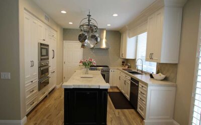
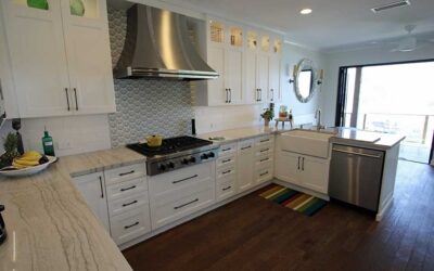
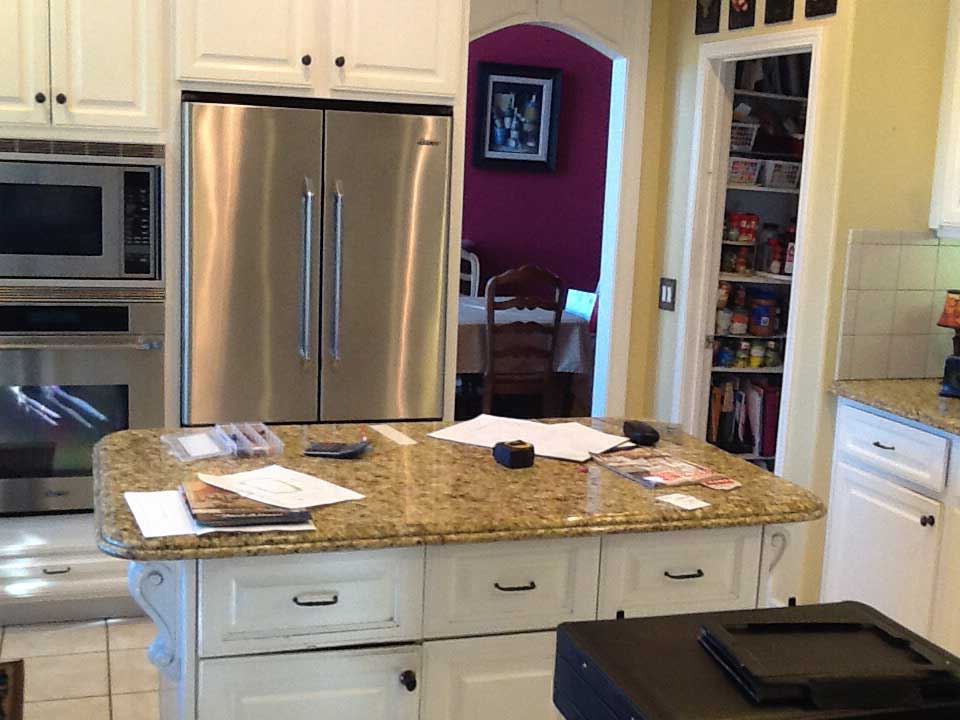
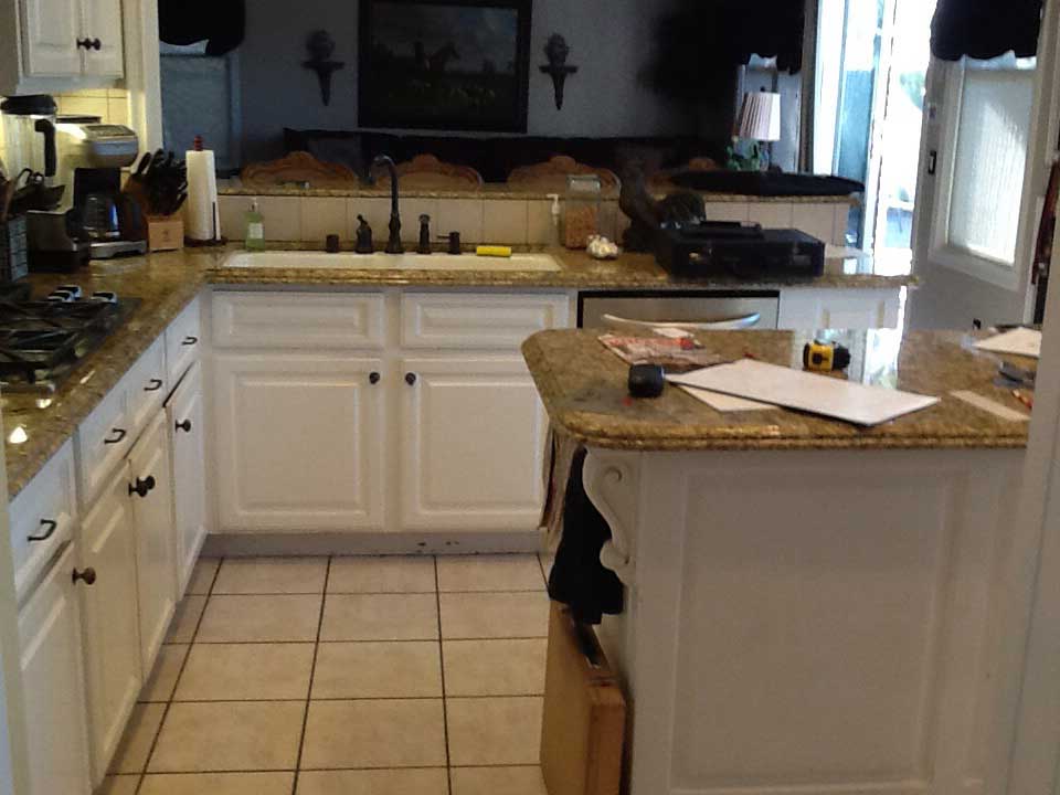
For the Maihens, residents of Dove Canyon, their previous kitchen design had some fundamental problems. First, it was cluttered. There wasn’t a lot of storage space, and there was also a dining table located in the kitchen that obstructed access to the majority of the cabinets that were originally there.
The layout and flow of the kitchen were limited not only by this table but also by the location of the peninsula bar.
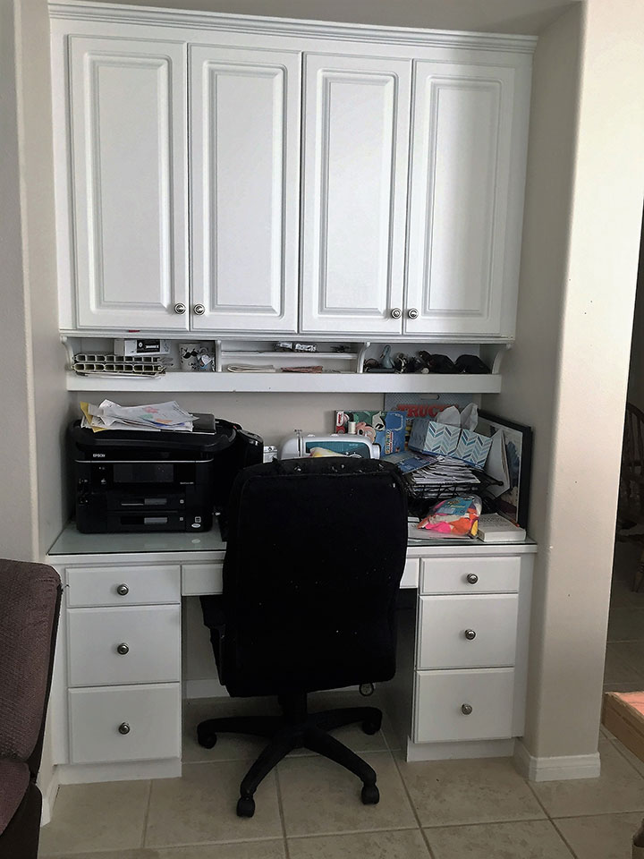
The edge profile of the countertop and the carved detailing led to an overly traditional feeling in the kitchen, whereas the homeowners wanted to move toward a design that was more transitional. A small workspace was located beside the bar, with a single desk that felt a bit out of place.
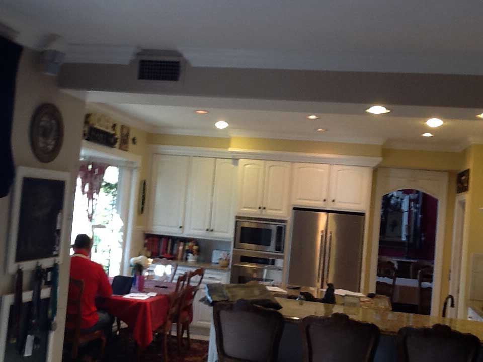
The previous pantry was incredibly cramped, and with basic shelving, it was difficult to locate items not on the front row.
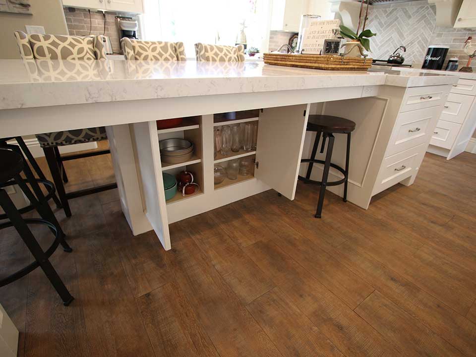
The finishes and design details of the kitchen were also relatively outdated, including the tiled flooring and the basic white cabinets. There was a bar in the previous design, but it didn’t offer seating space, and it was more ornamental than functional, as there was no storage beneath it.
A New Layout
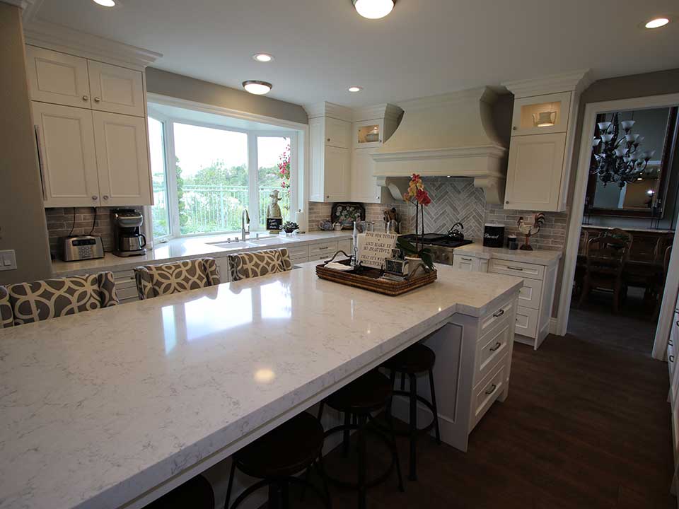
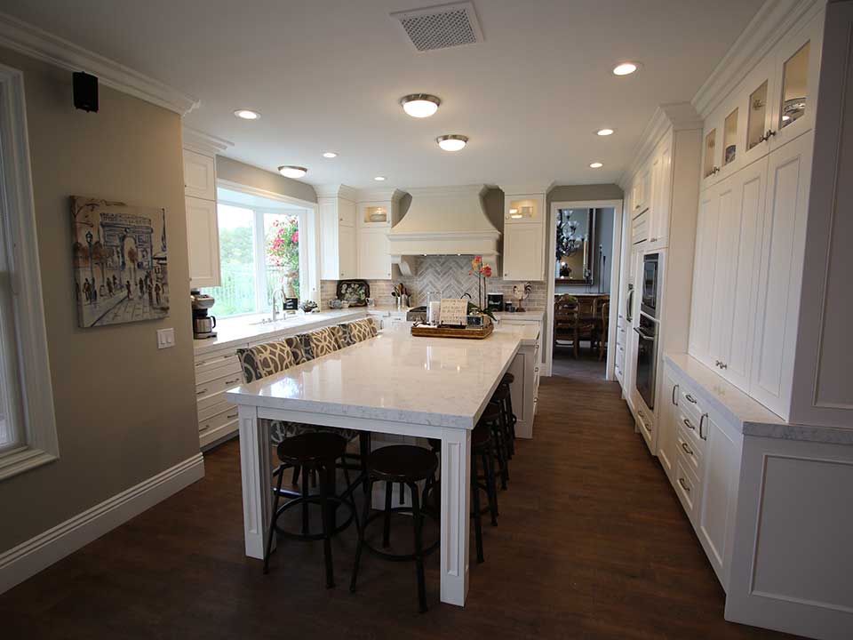
The first part of this Dove Canyon kitchen remodel involved a change in the layout. The peninsula bar was removed, and the kitchen was opened up to create a streamlined, vertically open floorplan. The differentiation in the various sectors of the kitchen was removed as a result, and there became a nice traffic flow throughout, all of which was centered around the expansive island that became the central focal point of this Dove Canyon kitchen.
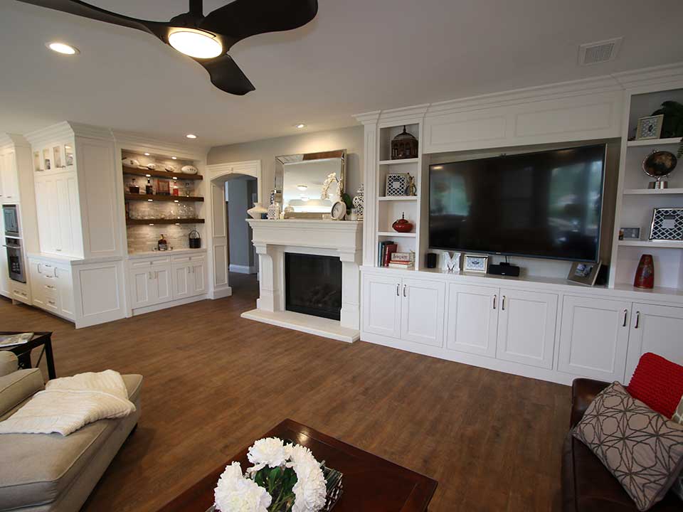
The entire space was pulled outward to create a better sense of flow with the living area as well. Where there was once the desk, instead the wall was designed to be continuous, and a bar area was added here. The bar includes floating open shelving in a contrasting dark shade of wood and a stacked stone-style backsplash. Accent lighting was added to highlight the details of this custom bar, and bottom shelving is the same as what’s found in the main area of the kitchen. Beautifully detailed moldings surround the bar, and frame the wide entryway.
The living area includes the same richly colored plank flooring found in the kitchen, as well as a fireplace redesign and a built-in shelving and entertainment center.
There’s a seamless flow between these areas as a result. Recessed lighting was added throughout, and the ceiling was raised, to make level and continuous, which is something it previously wasn’t.
White Transitional Cabinets and Countertops
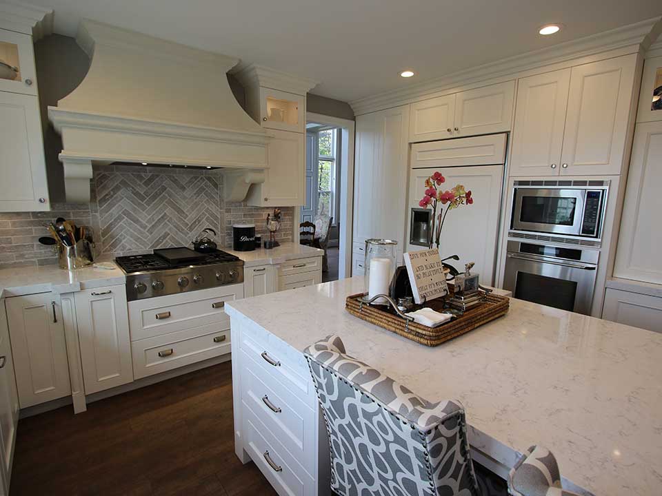
In the primary area of the kitchen, it was all about capturing the essence of a truly transitional design, which includes beautiful white cabinetry. The custom APlus cabinetry replaced the existing cabinets, which were standard white.
Now the kitchen includes maple Shaker Nadia cabinets in Swiss Coffee. The Bremen hardware includes horizontal handles on base drawers and vertical handles on the base cabinet doors.
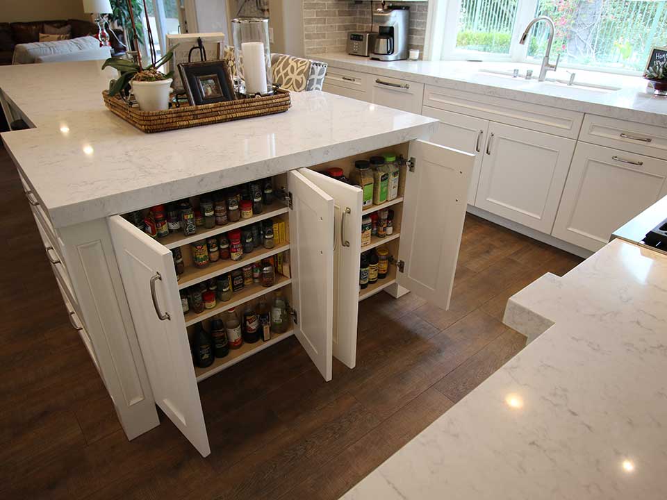
The kitchen island includes a traditional horizontal area, adjacent to an expansive vertically extended built-in dining area, topped with the same white stone used on the rest of the kitchen’s countertops. It includes seating for about eight people and is a beautiful addition that can be utilized not only for dining but also as a general workspace.
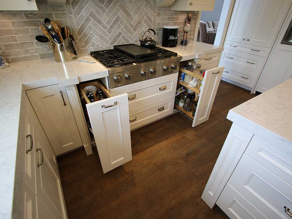
The Ceco double bowl under mount sink sits beneath a large bay window, and the brick-style backsplash runs around the perimeter of the kitchen, while above the range is a herringbone gray and white tiled detail.
The appliances include a GE Monogram built-in fridge, and a Daco 30-inch range, while the custom-built bar includes an Avanti wine fridge.
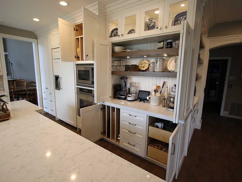
To replace the once tight and cluttered pantry, built-in cabinet pantries were created, ensuring the space feels sleek and continuous. All the cabinets extend to the ceiling where there are high-end moldings, and above the upper cabinets flanking the range there are inset glass panels with accent lighting.
