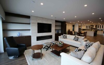
For the Rugetis, the owners of this lovely San Clemente home, what was critical when they decided to take on a kitchen remodel was along with the aesthetics, the functionality of the kitchen. They really wanted a design that included plenty of space for the family not just to gather, but also do homework and work. It was an Orange County remodel project that was as much about creating a space that caters to their lifestyle as it was giving their kitchen a fresh, modern update.
It was with that in mind that we began our planning for this San Clemente kitchen remodel.
The Before
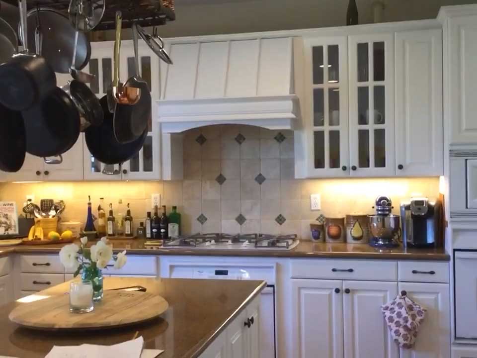
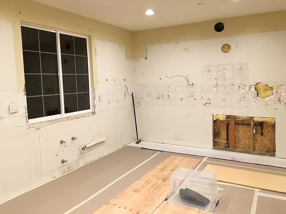
When you walked into the previous kitchen in this San Clemente property, there were a couple of significant issues. The first was that the cabinet design wasn’t maximizing available space. The standard builder-grade cabinetry not only lacked a sense of character or distinction, but the upper cabinets weren’t brought to the ceiling. This left an awkward, unused space between the cabinets and the ceiling that our design team felt could be put to better use.
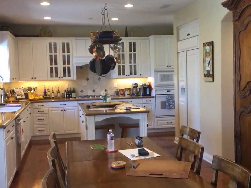
Also an issue was the large dining table that was central in the kitchen. It was frequently used by the Rugetis, but it didn’t create a streamlined layout, and it felt bulky and out of place.
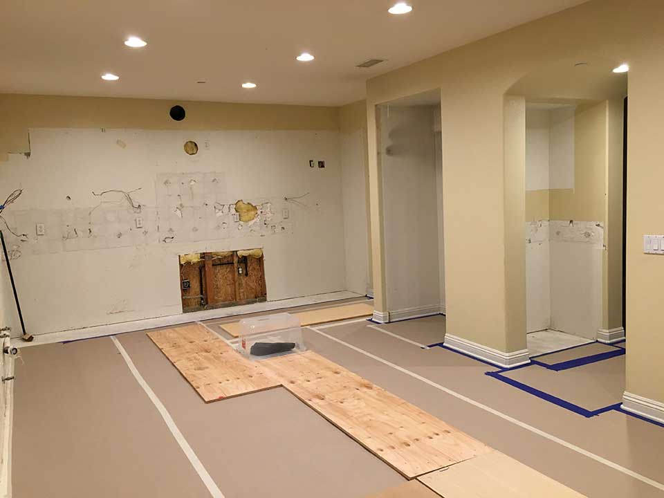
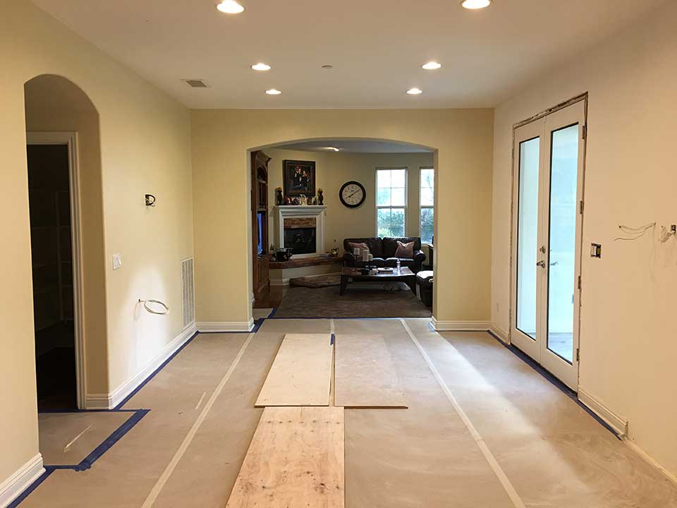
There were some nice features about the kitchen that we wanted to highlight including the overall layout, as well as the arched doorways.
A Transitional Kitchen Redesign
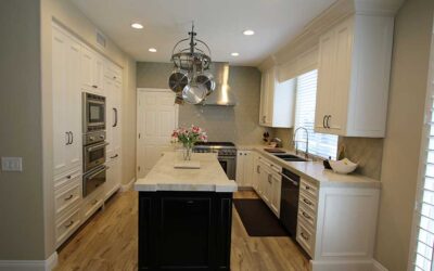
This San Clemente kitchen redesign focused on adding new custom cabinetry, creating a feeling of luxury, and incorporating areas of functionality that still felt cohesive and streamlined.
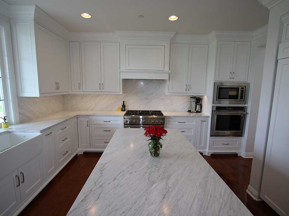
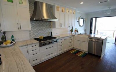
We added new custom cabinetry throughout, with a straight white finish. The cabinet design, which was created and crafted in-house by APlus, includes inset face cabinets with Craftsman 2 ½-inch door frames. Features such as double trash pullouts and spice pulls add to the functionality and subtly disguised storage that were pivotal to the overall design of the cabinets and the entire kitchen. The cabinets were accented with Belcastel hardware and extended all the way to the ceiling to maximize the available space.
Beautiful cultured marble was added throughout the kitchen and also added as a backsplash, which carries all the way up to the bottom of the upper cabinets. The result is one that feels sleek and modern, as well as opulent, yet it doesn’t take away from the clean, refreshing aesthetic of the kitchen. The countertop edge has clean lines and a square mitered edge profile.
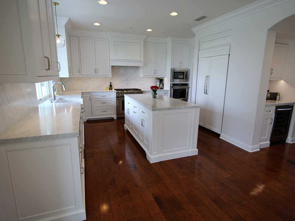
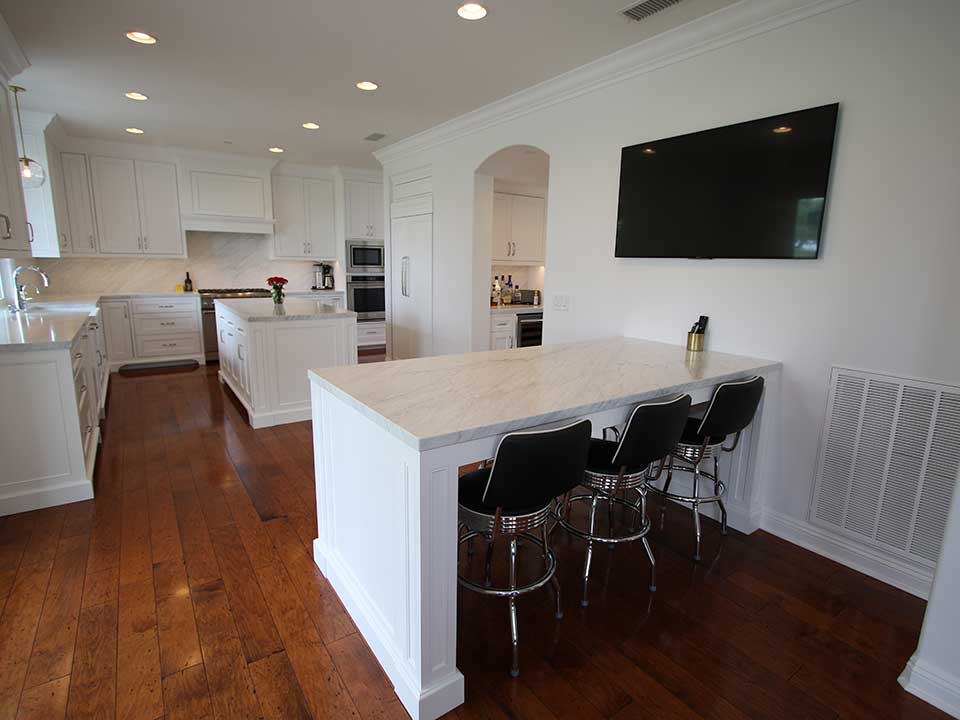
One of the big focal points of this kitchen, aside from the large island, was the custom peninsula that was added. The peninsula is expansive, with seating on either side. It’s designed much like a dining table, so it offers the ideal space for homework and studying, as well as mealtime and entertaining.
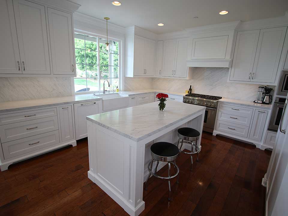
The appliances in this transitional kitchen include a 42-inch Imperial Hood, disguised beneath a custom hood cover designed by APlus.
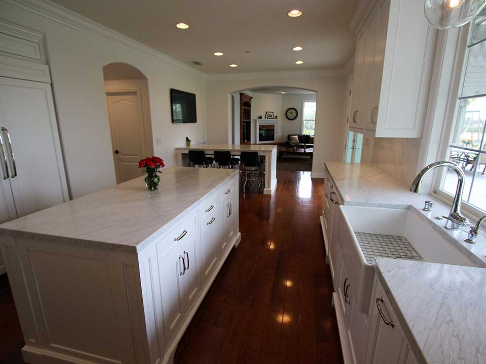
The KitchenAid 42-inch refrigerator includes a panel front to match the cabinets, while the sink is a Franke 33-inch farmhouse sink in Fireclay White.
The Thermador 36-inch gas Pro Harmony range is from the professional series, is flush-mounted and includes continuous cast iron grates.
Wine Bar, Office and Laundry Room
Also part of this remodel was the addition of a wine bar. The wine bar adds not only sophistication but also yet another space dedicated to functionality. It includes the same white cabinetry of the kitchen, as well as upper and lower cabinetry. There is a marble countertop, under-cabinet lighting, and a high-end stainless steel wine refrigerator.
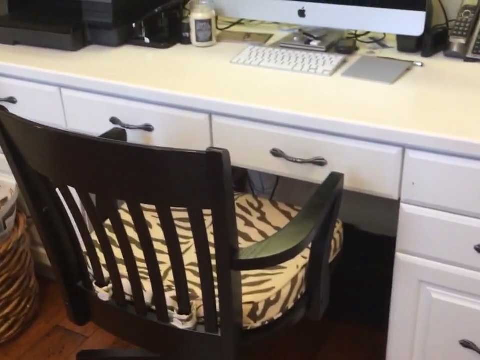
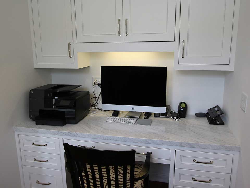
The homeowner needed a work space adjacent to the kitchen, and what they previously had in this area was an outdated and cramped desk. We crafted a custom desk and cabinetry for this space and added a marble countertop.
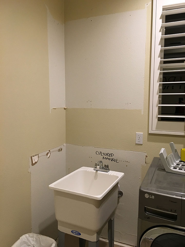
We also redid the laundry room to include a complete built-in pantry storage area that takes up an entire wall and includes both drawers and cabinets that can accommodate hanging items.
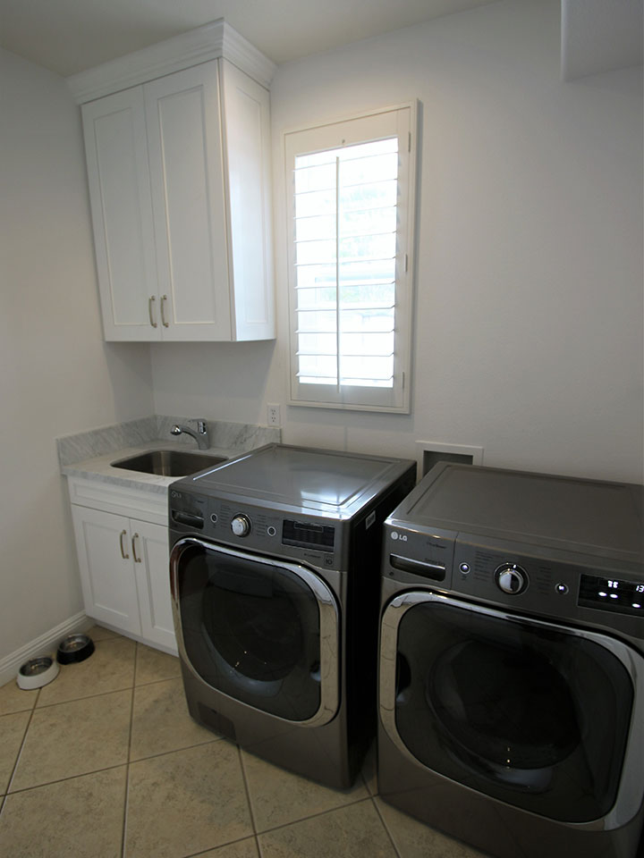
The result of this San Clemente kitchen and main level remodel is a large space that’s tailored to the needs of this family, and can grow with them and continue to work for their changing needs well into the future.

