In Yorba Linda, a youthful family wished to transform their home from run-of-the-mill to relaxed and classy. Our team worked with them to completely remodel their kitchen, as well as several other areas of the abode.
Before
The initial kitchen had a design that was a bit too lackluster to enjoy. Its main issue was a clunky layout that prevented easy movement in and out of the area. The appliances were arranged too closely together, so that having more than one person at work in the kitchen was just too much trouble. Additionally, the old refrigerator stuck out from its space in the surrounding cabinetry, making it always feel “in the way”.
As for the rest of the home, there were still dated features that detracted from the overall beauty of the residence. By simply making a few new installations, the home was able to be brought into the modern age.
Restructuring
We knocked out the wall that formerly separated the kitchen from the dining room, making both spaces feel all the larger. The new Johnson Hardwood “Moonshine” flooring was laid throughout the kitchen, and extended into the dining area. By choosing a slightly pale, rustic wood, we were able to give the new kitchen an earthy element without distracting from the sleekness of the new transitional design.
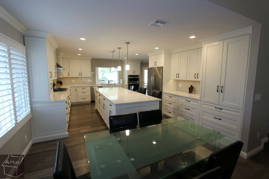
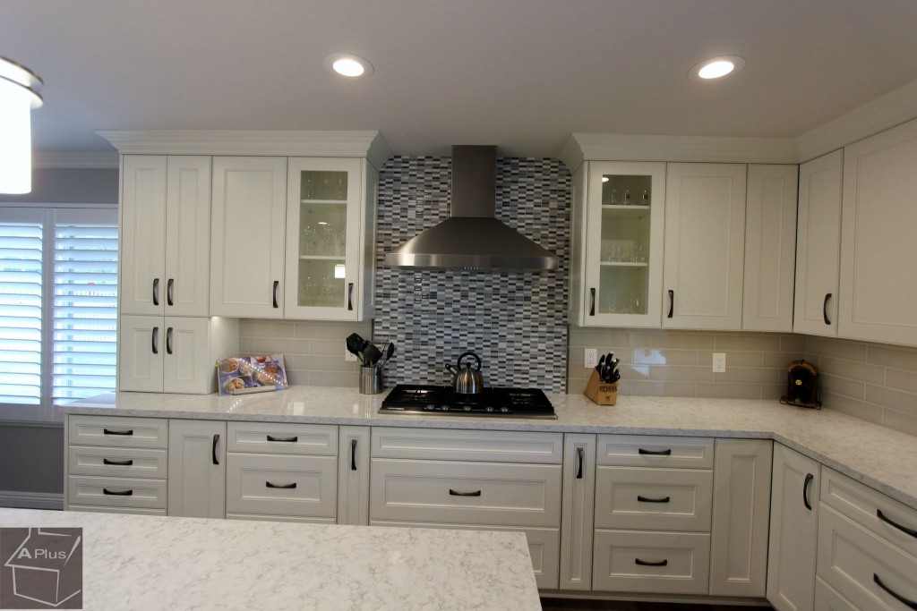
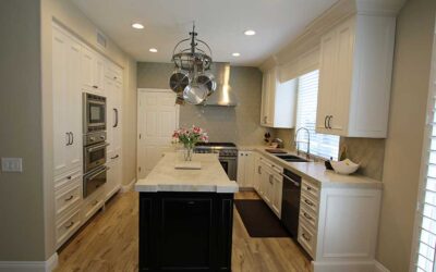
Next, we built brand new Euro & Face Frame style cabinets in paint grade maple with both Victorian and Jianas doors. They were painted in a creamy DE Swiss Coffee finish to give a clean look without using a sterile white. The cabinets were affixed with fully-concealed hinges for a neat design, as well as dark Cairo handles and knobs for contrast. On the interiors we used hard rock melamine, leaving it in its natural color. There is both sub-crown and shoe moulding. On opposite sides of the ventilation hood, the cabinets have glass insets, and below, there are convenient spice pull-outs. In some of the corners are fold-out doors, which enclose two shelves with lazy suzans.
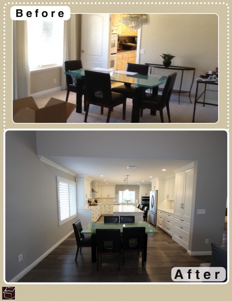
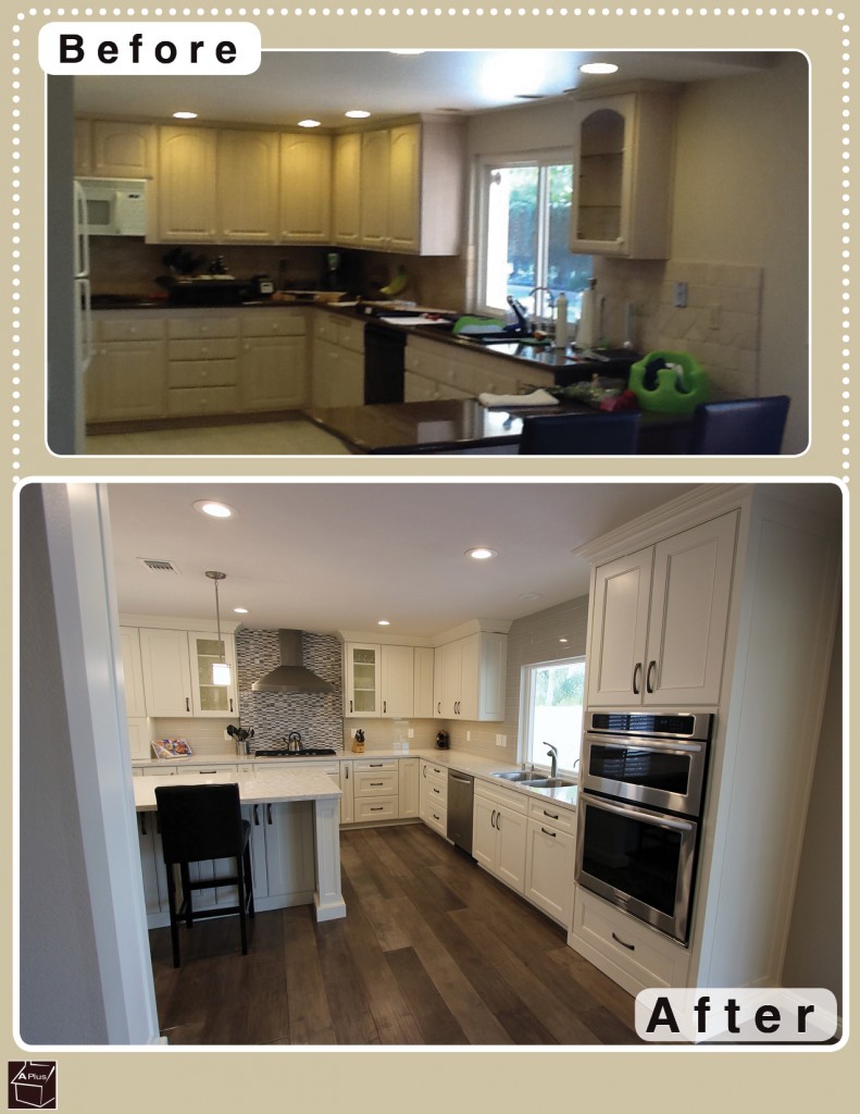
Since the old bar was removed in the demolition stage, we replaced its functionality by building a large center island. It provides ample seating, as well as additional counter space and storage.
For the countertops, we installed 1 ½” straight edge quartz from LG Hausys in a light finish called “Minuet” to match the cabinetry.
The walls were covered with a full-height backsplash of Arizona Pumice Tiles, and below the ventilation hood, ornamental tiles were set.
Appliances
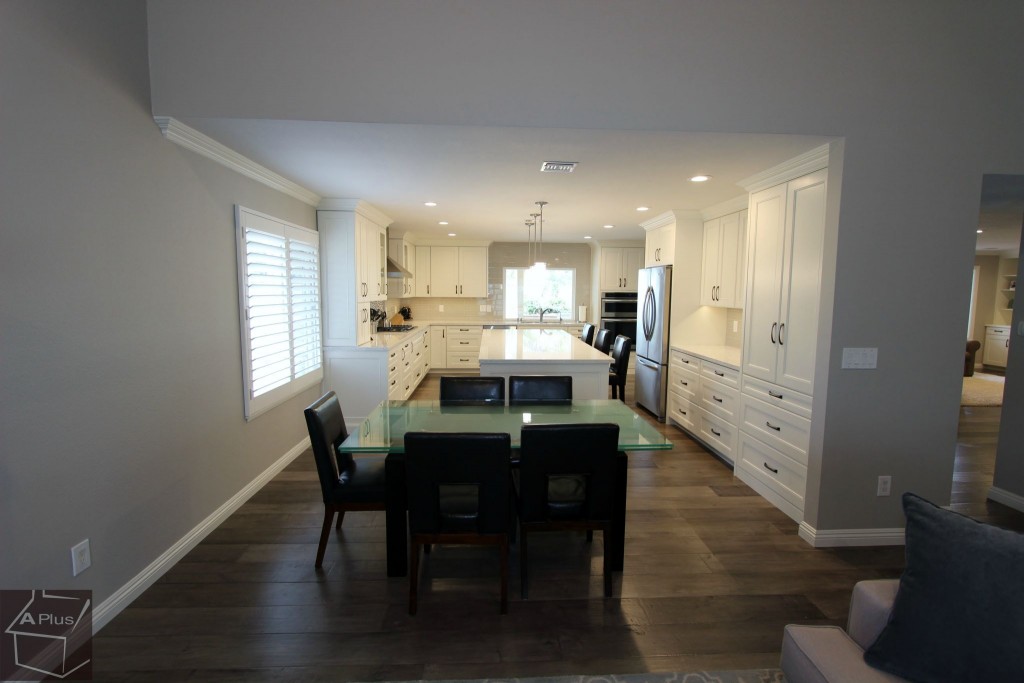
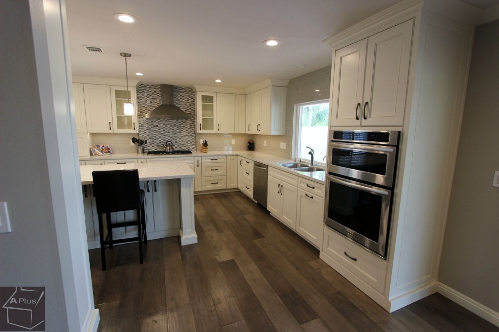
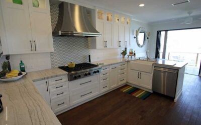
The appliances were chosen to allow the chef of the house to indulge in their love of cooking. Warming drawers were integrated into the cabinets, enabling the preparation of many dishes at once. A Windster 36” Hood was placed above a Kitchenaid 36” 5-Burner Gas Cooktop from the Architect Series II. To the right, on the adjacent side, a Franke 34” “Regatta” Undermount Double Bowl Stainless Steel Sink is set between a Kitchenaid 24” 6-Cycle/6-Option Dishwasher and a Kitchenaid 30” Convection Combination Microwave Wall Oven, both from the Architect Series II as well. Also from the same collection is the Kitchenaid 36” 22 cu. ft. Counter-Depth French Door Refrigerator, now aligned perfectly with the cabinetry and counters.
Back Door
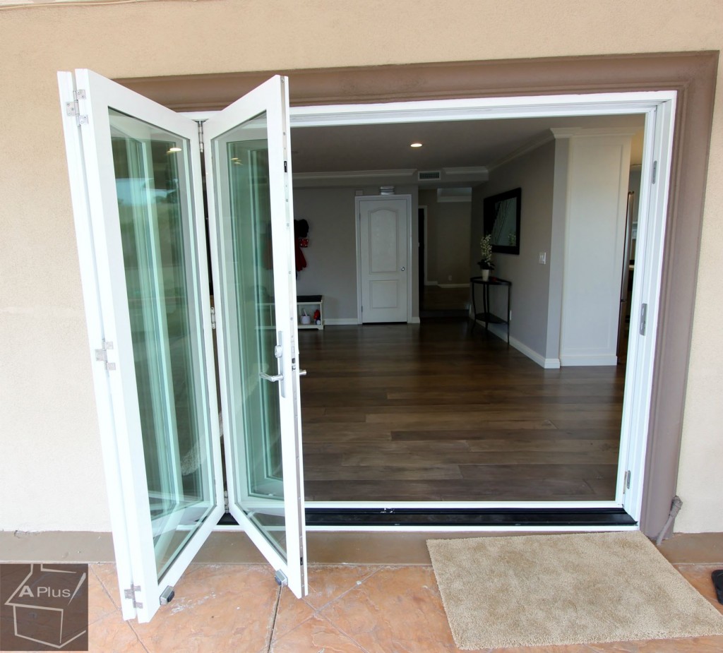
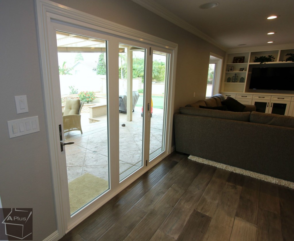
Previously, the entry to the backyard was a traditional sliding door. While the glass provided a full view into the yard, the fact that the door only opened to halfway down the panel still left a barrier. In order to facilitate an airy, laid-back feel, we installed a three-panel accordion door that offered the same view, yet opened all the way. This feature is great for when the homeowners want to throw barbecues or simply let in the breeze, as it opens up the house to make the backyard into an additional room.
Fireplace
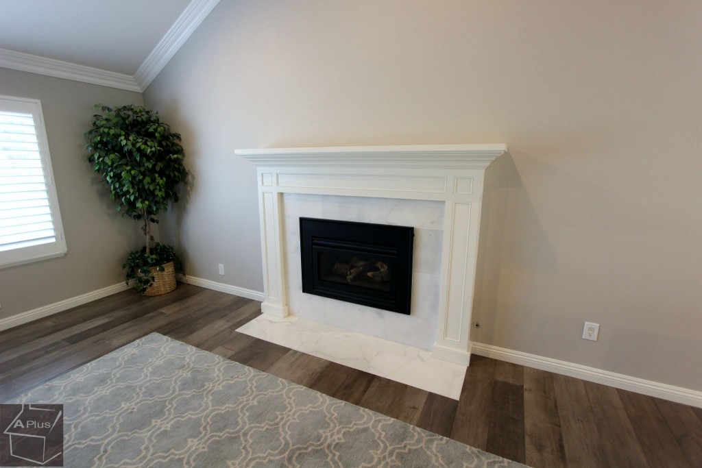
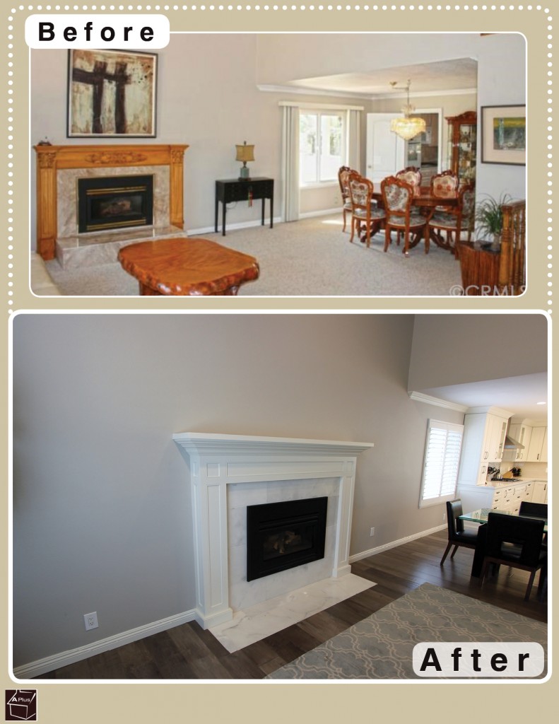
The former fireplace had a golden oak mantle that felt a bit too antiquarian for this freshly updated home. We gave it a facelift by resetting it with smooth white paneling and moulding that features simple lines.
Entertainment Center
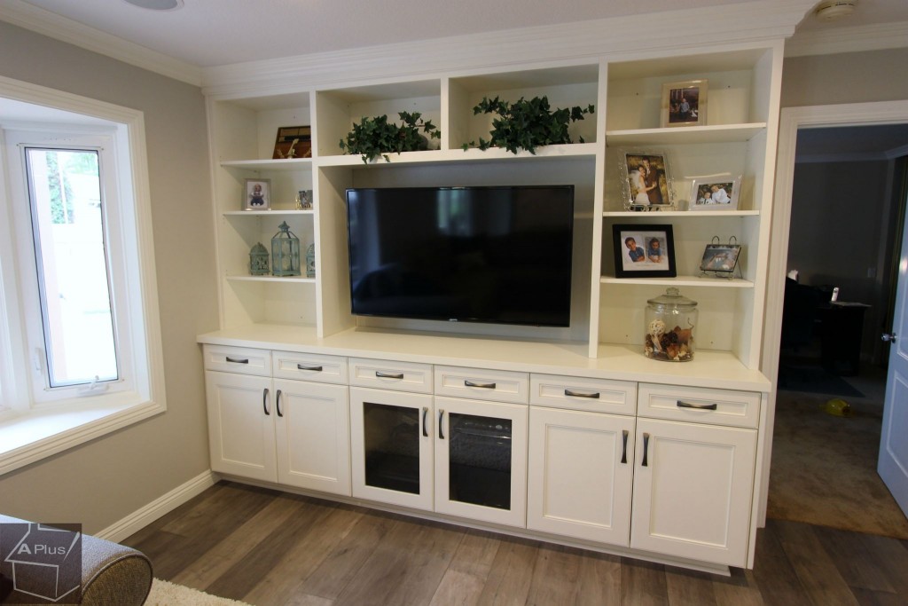
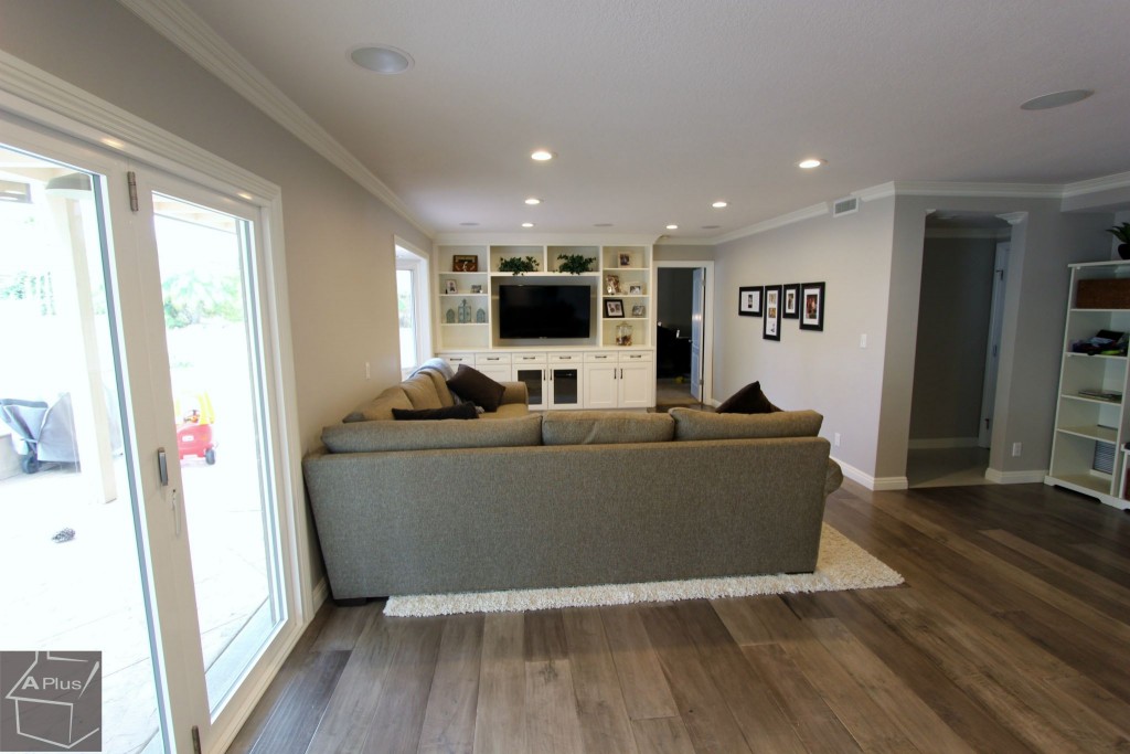
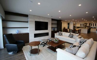
The owners had a big flat-screen TV that deserved a better showcase than being set against an empty wall. Where it sat before, it was hard to even see that the space had the room for the large and storage-laden entertainment center we put in. We used the same cabinetry materials as in the kitchen to maintain a cohesive style. Drawers and cupboards were set below the TV mount, while large shelves were set on the sides and top.
Bathroom
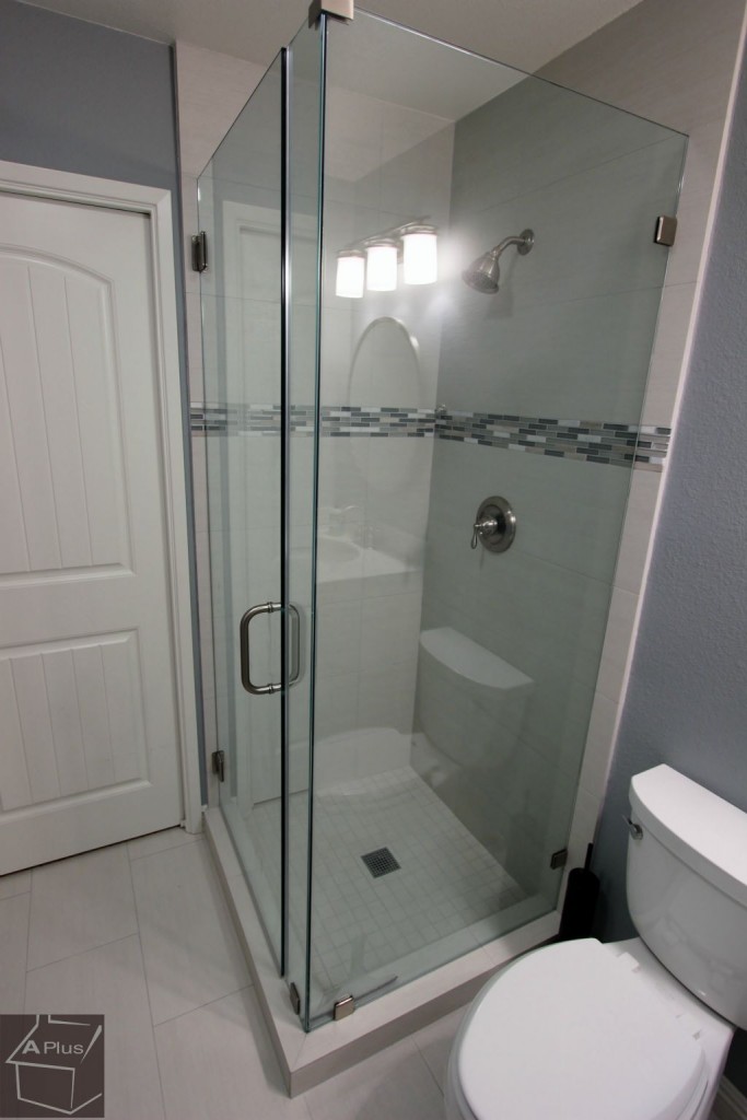
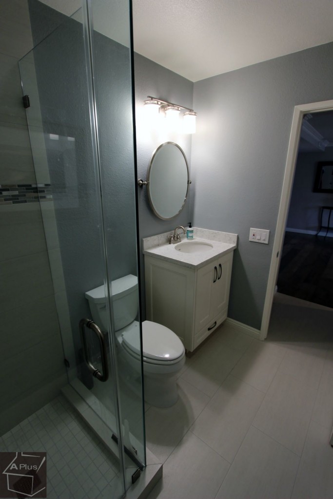
We took out the old gilded shower frame and replaced it with a modern glass model that features custom tiling on the inside. The tiles used for both the shower and floor are Arizona Tiles Metal Wood Platino. The cupboard was updated with the same materials as the kitchen and entertainment center.
Would you like to remodel your Yorba Linda Home? Contact us today. As one of Orange County’s premier contractors, we can help you achieve beautiful home design through professional renovations.

