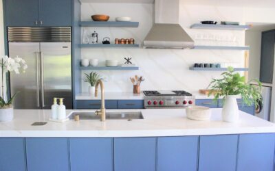
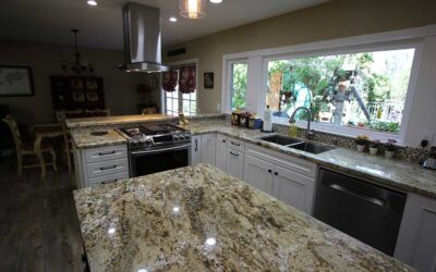
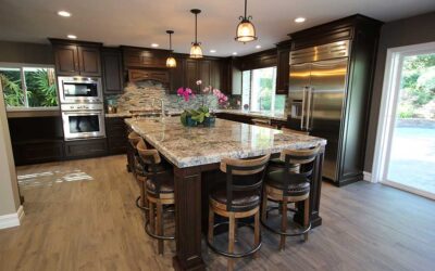
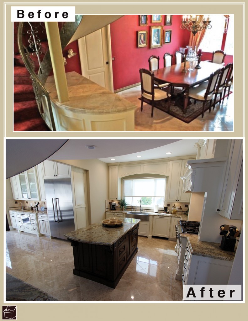
A Huntington Beach home’s kitchen and dining room had an overbearing ambience that was in drastic need of repair. APlus was entrusted to update the areas with a dramatic renovation.
Before
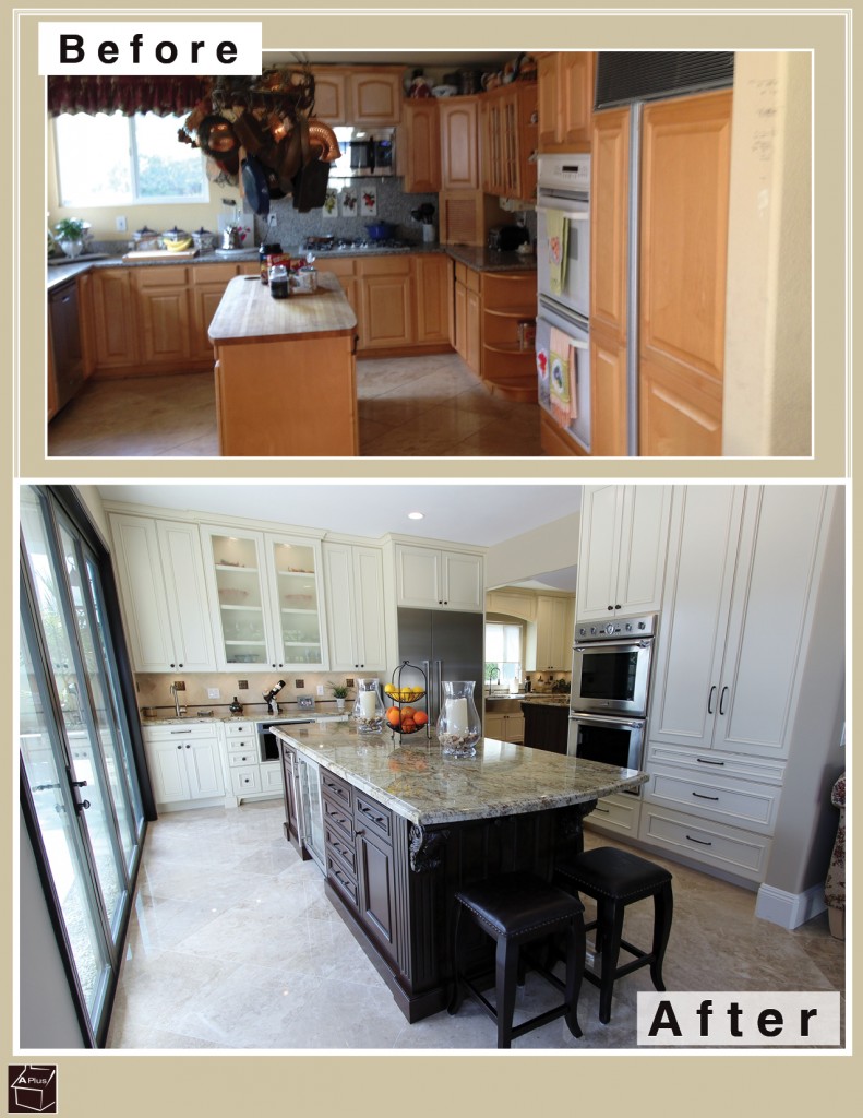
Prior to our remodel, this kitchen and dining room served as great examples of how going bold can go bad. The kitchen area was overwhelmed by bulky wood cabinetry taking up almost every inch of space, and the hot pink walls of the dining room clashed with the antique chandelier, table, chairs, and frames. The two rooms were completely separated by walls and doors, making the rooms feel smaller and increasing the difficulty of entertaining dinner guests.
Restructuring
Our renovation process started by knocking out a big portion of the wall between the dining room and kitchen. This transformed the rooms into one. We then did an overhaul by taking out all old cabinets and building anew Euro style maple cabinets with Craftsman doors and melamine interiors – creating a traditional look. Some are inset with frosted glass panels. All of the perimeter cabinets were finished with Whisper White paint, while the two islands were finished in a dark Espresso Brown. The pale hue of the perimeter makes the room look more fresh and open – a far cry from the dark and cluttered original design. Dark knobs and drawer pulls gives a sophisticated style by contrasting with these light cabinets and blending with the dark ones.
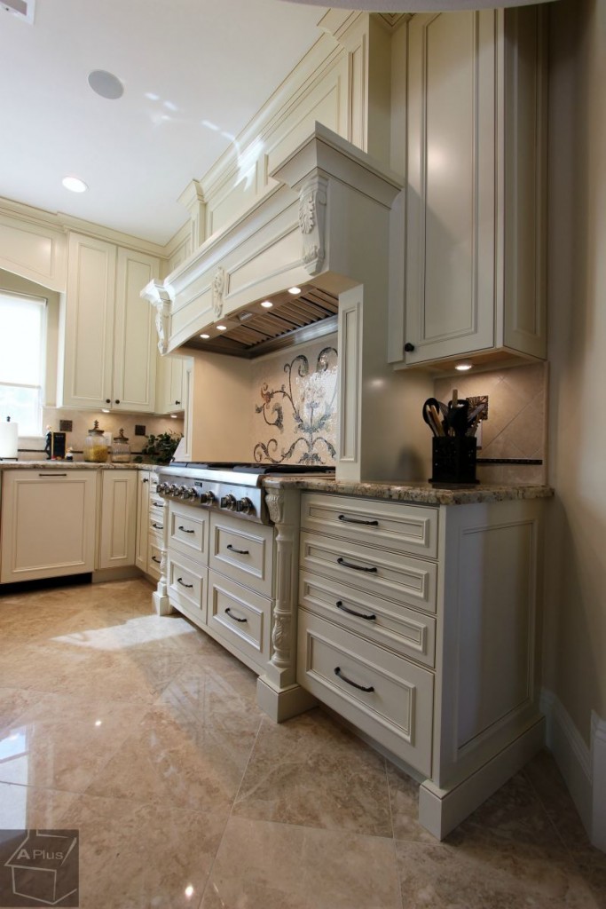
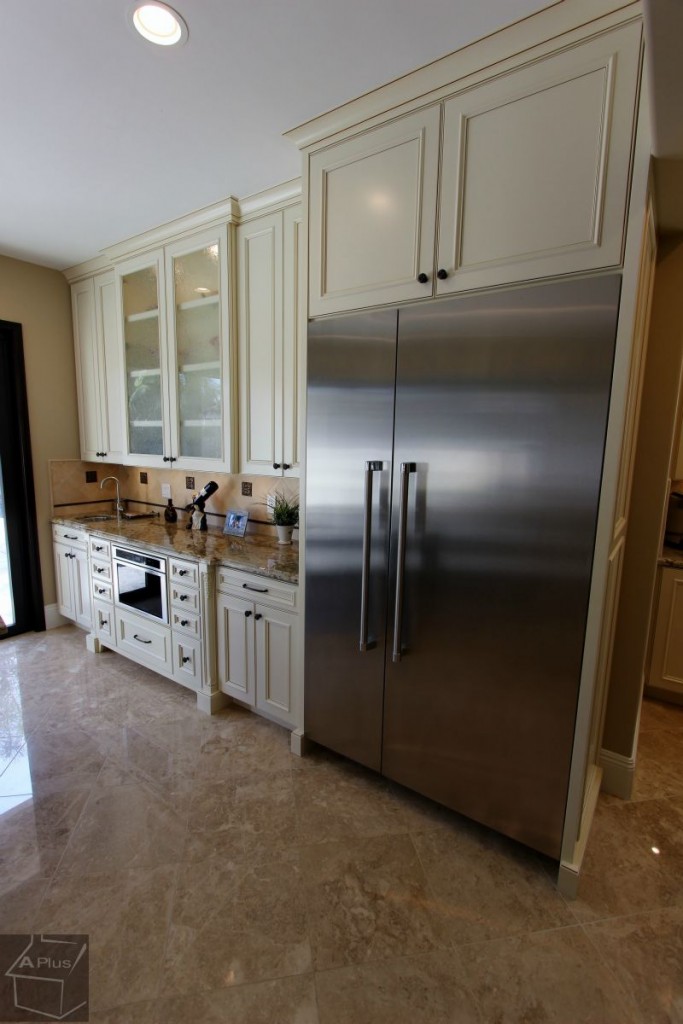
To add extra polish, the upper and lower cabinets alike are trimmed by refined moulding. For the countertops, our clients selected square edged Pental Quartz in an earth-toned Carrara finish.
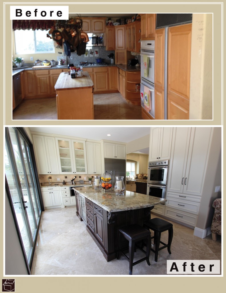
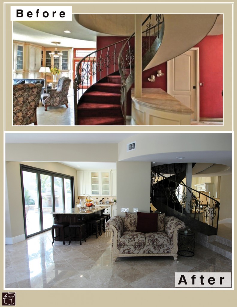
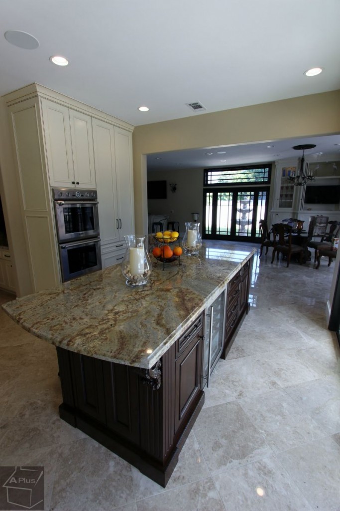
The first section of the kitchen is designed to be where most of the everyday cooking and dining takes place. Since the owners had little use of the old formal dining room, we gave them a casual alternative by making this section’s island double as a bar with ample seating. On the far side of the island, we built in a myriad of drawers and cabinets to contain dishes, liqueurs, and other accessories. There are also decorative carvings that instill a subtle touch of class. Before the renovation, this area had a large recessed ceiling from which hung an unwieldy pot-rack. The ceiling is now even and the rack was replaced with minimalistic recessed lighting. On the back wall, the wall space between the upper and lower cabinets is dressed up with a neutral tile backsplash that features a few tasteful accents.
Instead of encumbering the left wall with more cabinetry before, we opened up the entire length by installing a long folding back door with ceiling-height glass panels that give a full view of the backyard. This door can be opened completely to make the room into an open-air kitchen. Even when closed, it lets in so much light that it’s impossible for the kitchen to look anything but bright and inviting.
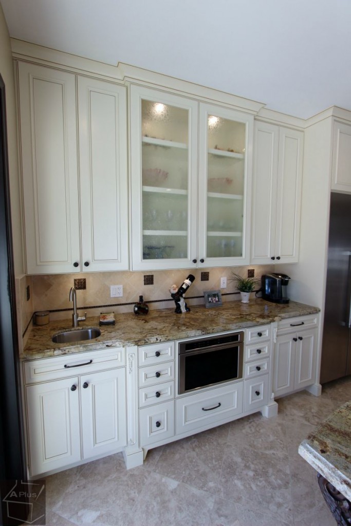
Moving into the second section of the kitchen, the former dining room, you can see some of our best custom cabinetry work. The island features ornamental carvings below the countertop, and the window section is shaded by an elegant arch. Below it, the sink is bolstered by posts that feature subtle decorative flourishes. To the right, even more of this decorative detail appears in the custom carvings of the ventilation hood casing, and the posts framing the rangetop below it. Above the rangetop is a gorgeous custom floral mosaic, composed with colorful, glossy tiles. As in the first section of the kitchen, the wall space between all of the upper and lower cabinets features the same chic backsplash.
Appliances
On the back wall of the kitchen’s first section, we placed the GE Monogram Free-Standing Side-by-Side Refrigerator to the right of the under-counter microwave which is installed flush with the surrounding drawers. To the left is a small stainless steel undermount sink. The adjacent wall has the Thermador 30” Professional Series Stainless Steel Combination Oven with Convection Microwave built right into its full-height cabinetry, and the center island contains a small wine refrigerator.
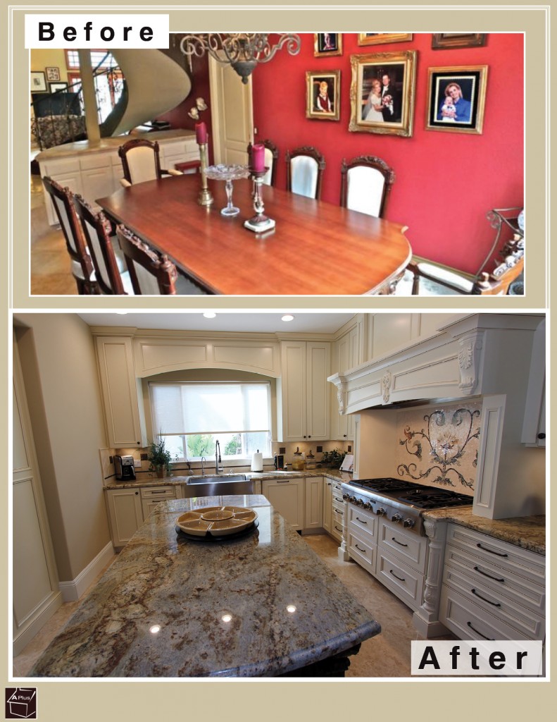
The kitchen’s second section has a Thermador Emerald 24” Dishwasher which has been paneled on the front to blend in with the surrounding cabinets. It sits next to the large stainless steel apron-front farmhouse sink. Within the custom wood casing of the right wall we placed a state of the art Windster Hood, which will deftly dispense with all smoke and steam created from cooking on the new Thermador 36” Professional Series Rangetop below.
Staircase
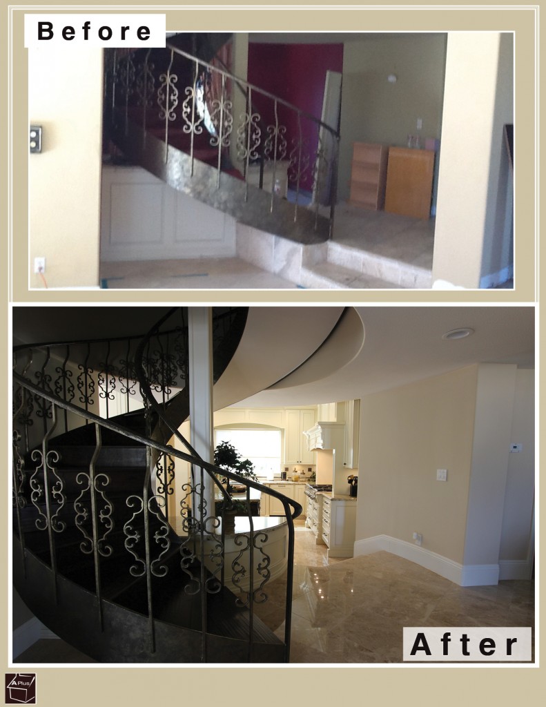
We kept the old staircase, but removed the kitschy red velvet step coverings. The new bare look of the steps is much more stately and fitting with the elegant appearance of the rest of the home. Since the backside of the staircase is now more visible thanks to knocking out portions of the old dining room’s walls, it now becomes a stunning architectural feature of the kitchen’s second section, rather than an awkward intrusion.
Dramatic renovations like this can take place in any home – even yours! If you’d like to get a beautiful remodel of your Orange County abode, contact APlus today!

