APlus was contracted by these Newport Beach homeowners to take their property. Turn it from a home that was outdated and traditional into one that felt updated Transitional kitchen fresh, with hints of modern design and a space more suited to the lifestyle needs of the family who lives there.
Before: The Main Level
While APlus worked on entirely reworking most of this Newport Beach home during this full-scale remodel. One of the biggest undertakings of the project centered around the lower level of the home. The Newport Beach home featured scenic views and natural light, but the floorplan was inefficient and felt cramped and blocked.
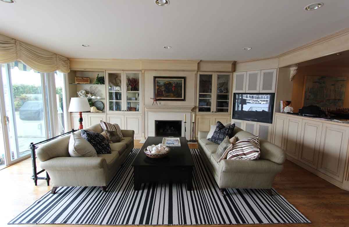
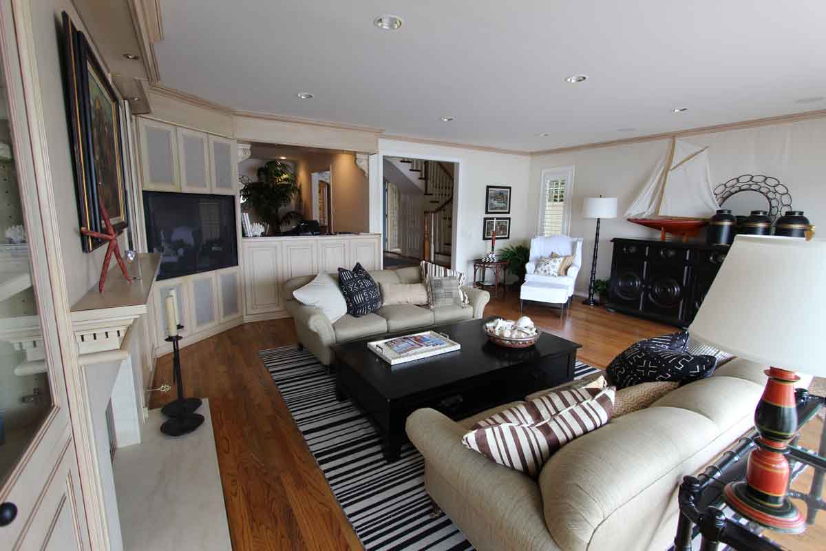
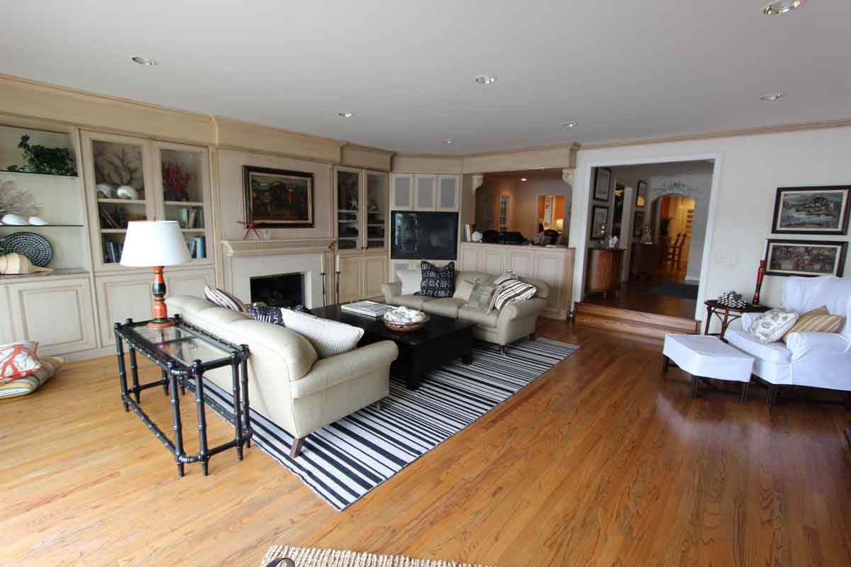
When you first walked into the main level of this home the layout was disjointed and lacked any kind of flow. The family room, while set against the backdrop of large sliding doors offering great views. Was entirely traditional in its design, and separated from the dining room by a pony wall.
The walls in the family room featured ornate, traditional cabinetry and a fireplace was the focal point. While the television was tucked away in a corner that made it difficult to see. There were heavy moldings throughout that seemed to bring the ceiling downward in the family room as well.
While the space wasn’t necessarily small. it felt very cramped since it was disconnected from the rest of the main living areas of the home.
The original design before the APlus remodel in this Newport Beach home was anything but an open concept.
Looking toward the rest of the home from the family room, there was a small hallway and an attached dining room with only a doorway leading to the kitchen.
Each nook of the home seemed to stand on its own. rather than working together or offering functional flow.
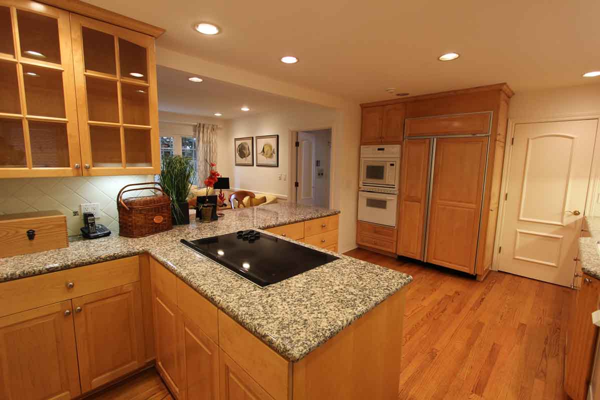
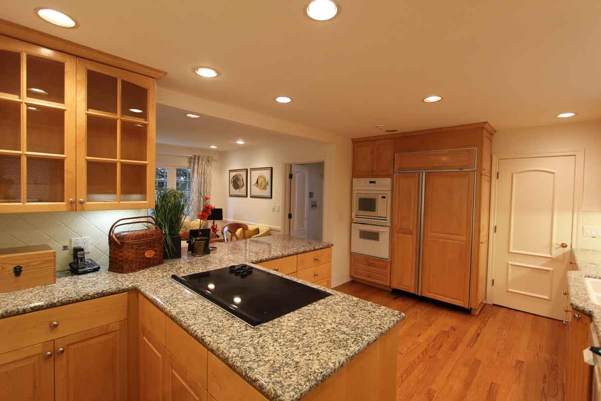
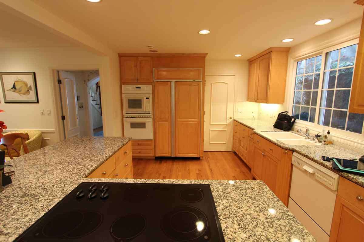
The kitchen was similarly disjointed and as lacking in flow as the family room and dining room. A peninsula jutted out from the wall, and that wall served to obstruct the views to a connected sitting area. Another peninsula also separated areas of the kitchen, and the overall usable space in the kitchen was limited.
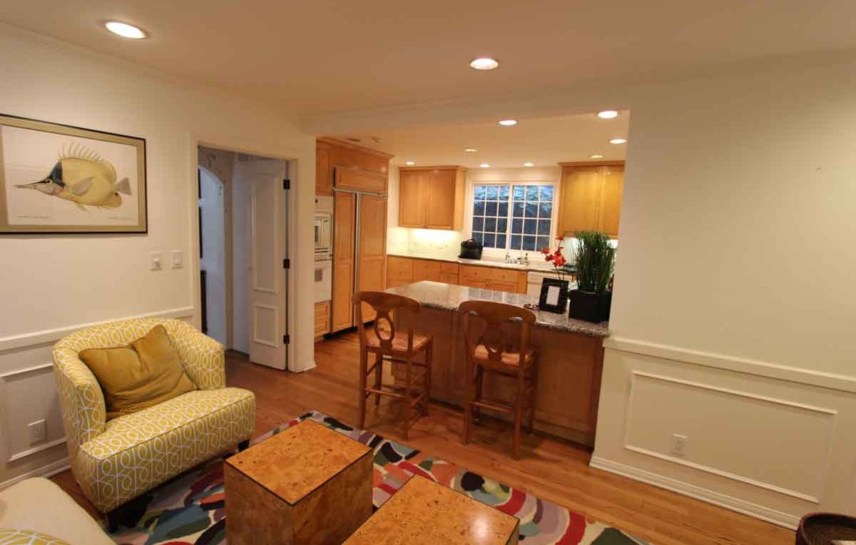
The cabinet layout and floorplan felt choppy, storage was limited. there were no sight lines from the kitchen to the rest of the main level. Since there were no views to the much brighter family view, the kitchen felt dark and cumbersome..
White appliances and light wood cabinets were also part of the original kitchen design before this Newport Beach remodel.
Before: The Bathrooms
Along with a complete remodel of the main level of this Newport Beach home, APlus also took on the task of modernizing the bathrooms.
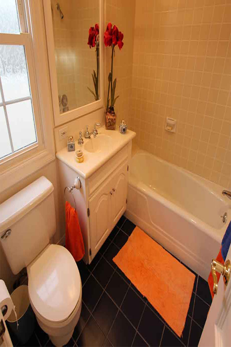
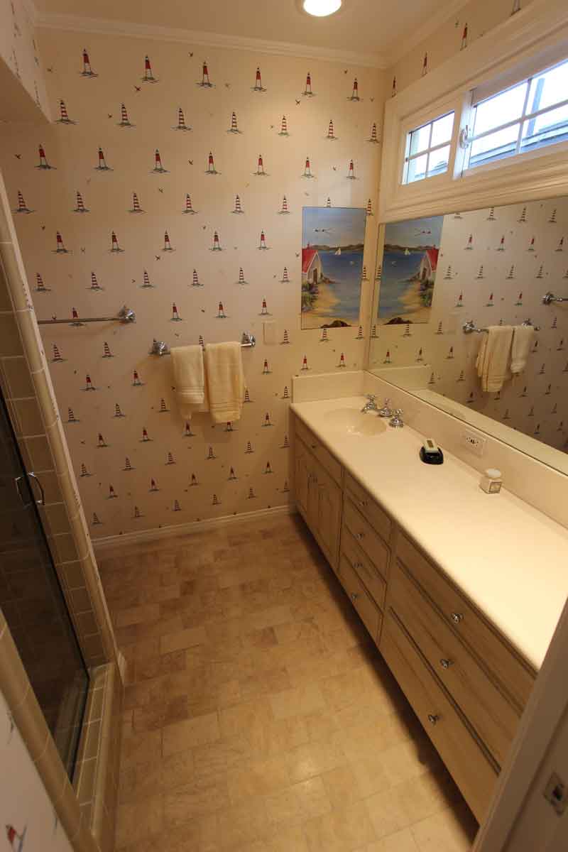
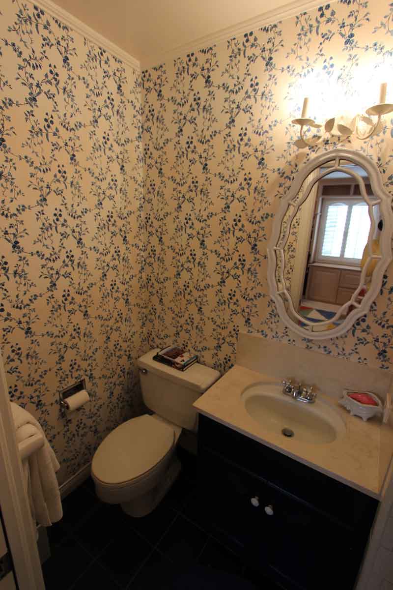
Each of the bathrooms felt outdated and lacking in a general design direction. For example, the in the bathroom belonging to the daughter, there was a standard-grade tub surrounded by yellow square tile, and on the floor was contrasting black tile. The vanity was also standard builder-grade, and there was nothing truly distinctive or modern about the bathroom.
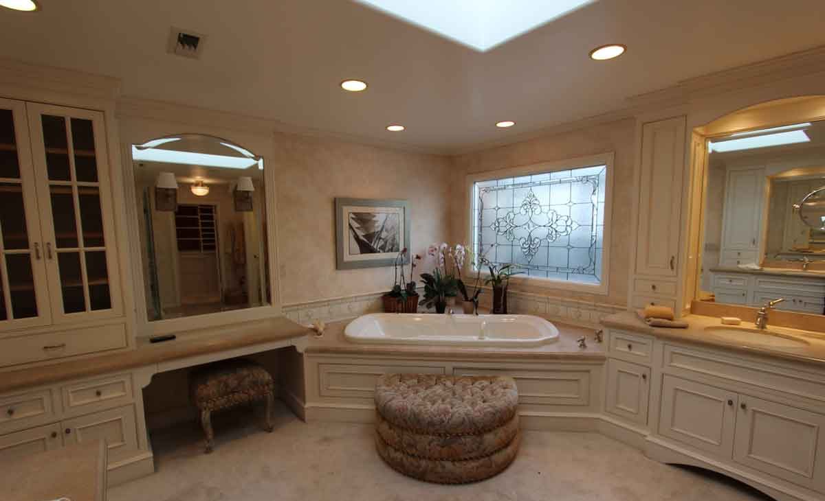
Walking into the master bathroom, the space felt spacious but incredibly outdated. The area with the sinks and bathtub was carpeted, the cabinet style of the vanities and storage was again ornate and overly traditional, and above the corner-set tub, there was a stained glass-style window.
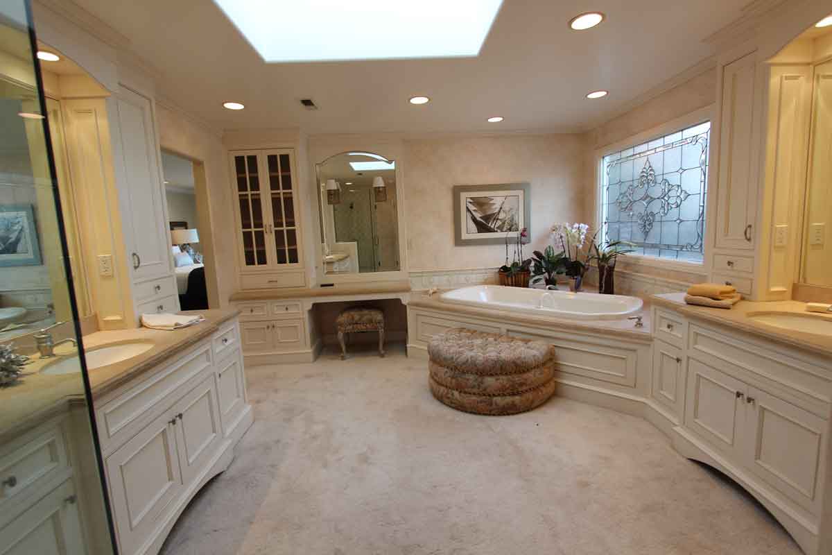
The tub location in the corner of the bathroom actually took up a lot of unneeded space because of the built-in surround, and that space could have been used more efficiently.
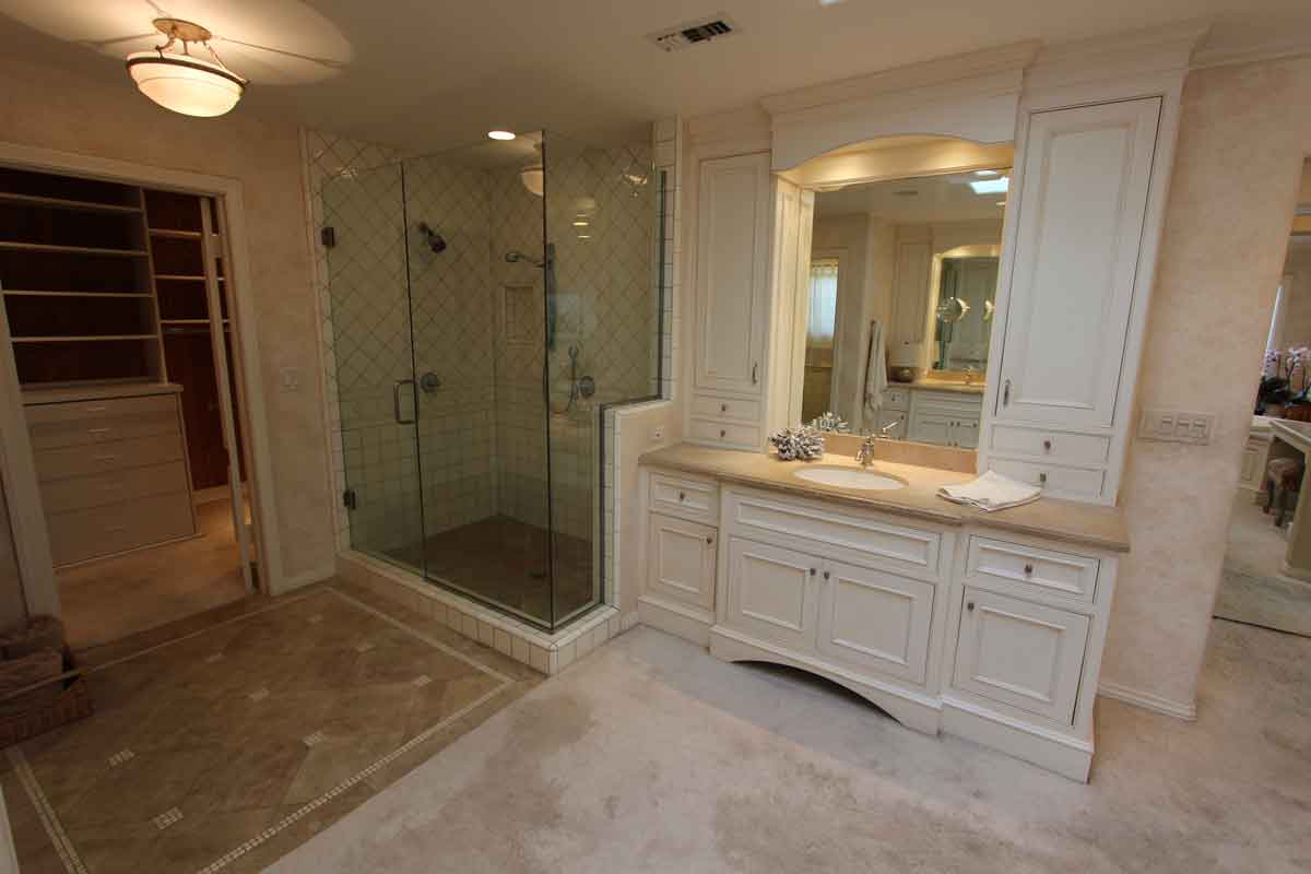
The shower was relatively small and closed-in, as was the shower in the other bathroom remodeled by APlus.
The goal with all of the bathrooms was to first and foremost update the spaces, but also to maximize their functionality and efficiency.
The Main Level Remodel
The most critical aspect of this Newport Beach remodel was opening up the main level and creating a usable open-concept floorplan. It was important to eliminate unnecessary walls, break down barriers to sight lines, and just make a flow on the main level that felt less restricted and broken up.
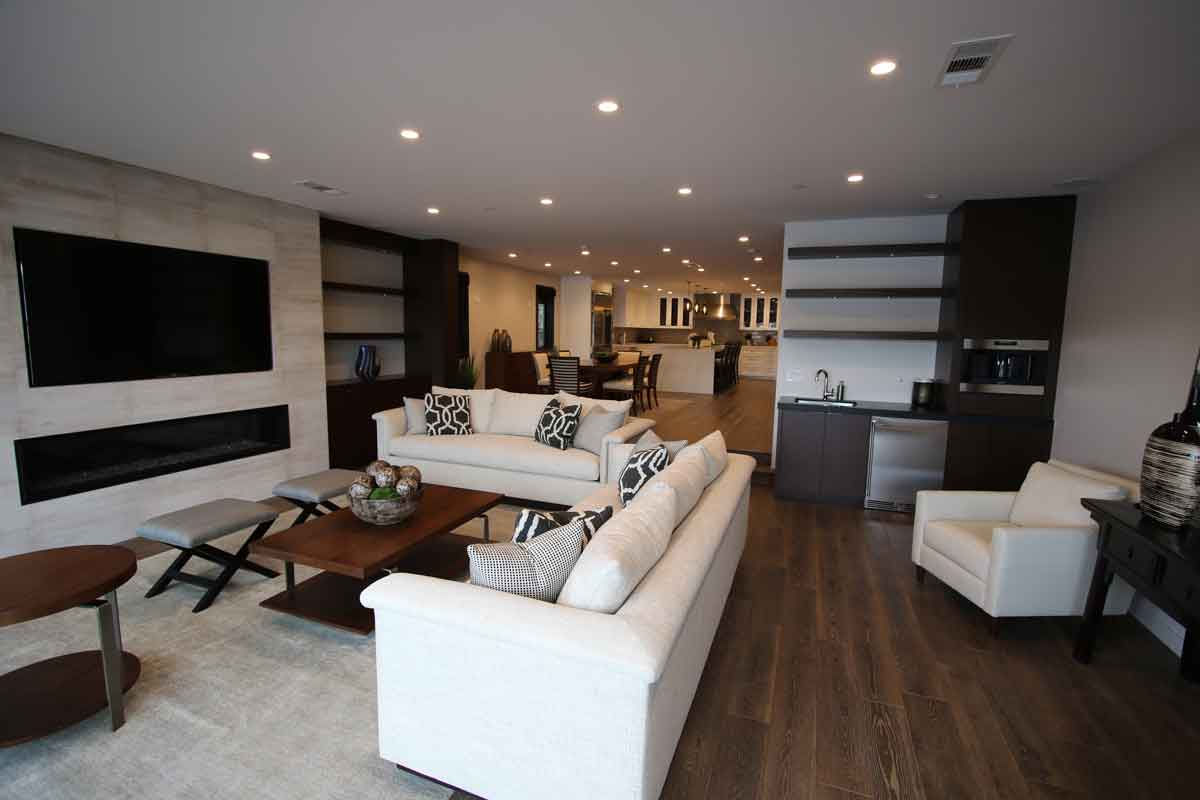
With that in mind, in the family room, APlus removed the walls dividing the space from the dining room, and also removed the hallway and walls separating the kitchen from the rest of the home.
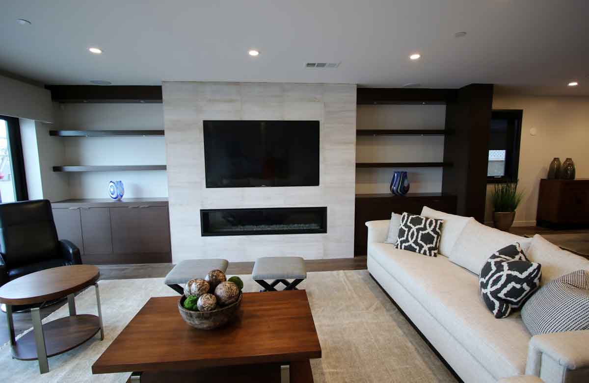
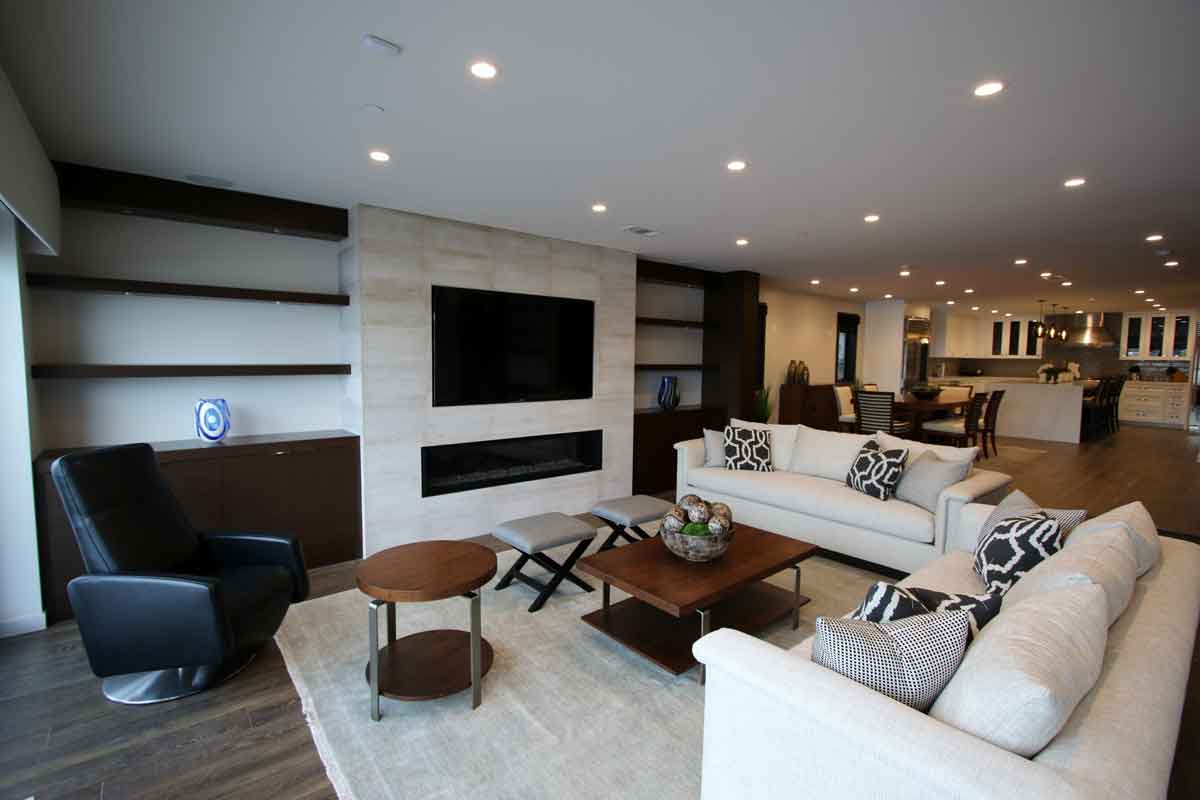
The old cabinetry and built-ins were removed and replaced with stylish. Custom espresso built-in shelving and cabinets for additional hidden storage.
The combination of custom built-in shelves and cabinets in and espresso finish flanked a newly redesigned fireplace with tile in a color called “Acid Wash White Oak.” Also becoming a hub of entertainment in the family room, the TV hangs above an inset modern gas fireplace.
In the corner of the family room is a designer wet bar, perfect for entertaining and enjoying the views of the space. The wet bar includes a Discovery Wine Dispensing System from Dacor and an under counter gourmet ice machine from Scotsman.
Post-remodel, the homeowners, can now see directly into their dining room and kitchen and vice versa, with no interruptions.
Transitional kitchen
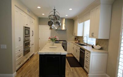
The kitchen was a significant undertaking in this Newport Beach home remodel project. The homeowners wanted a transitional design that felt modern, but at the same time warm and inviting.
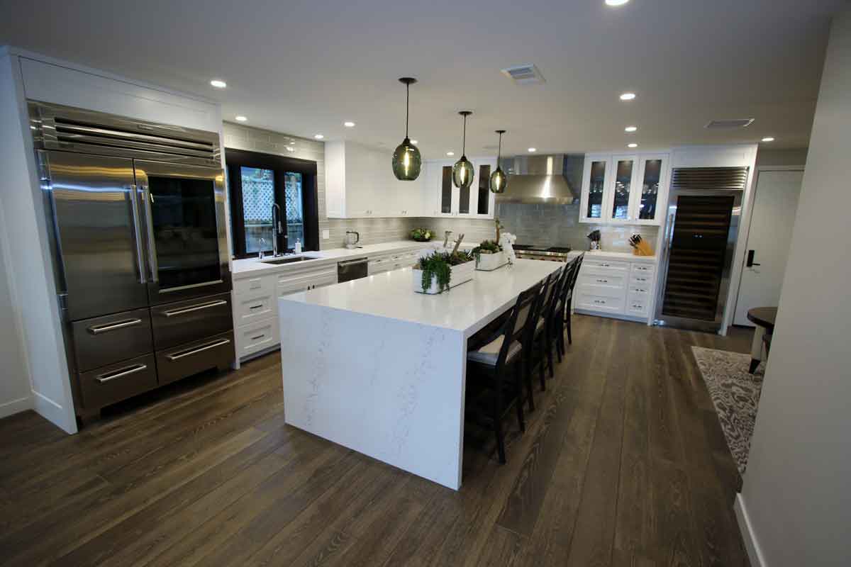
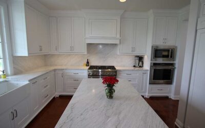
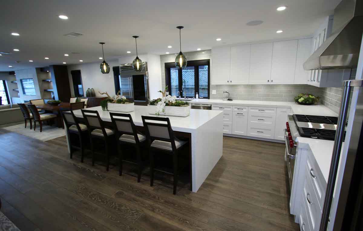
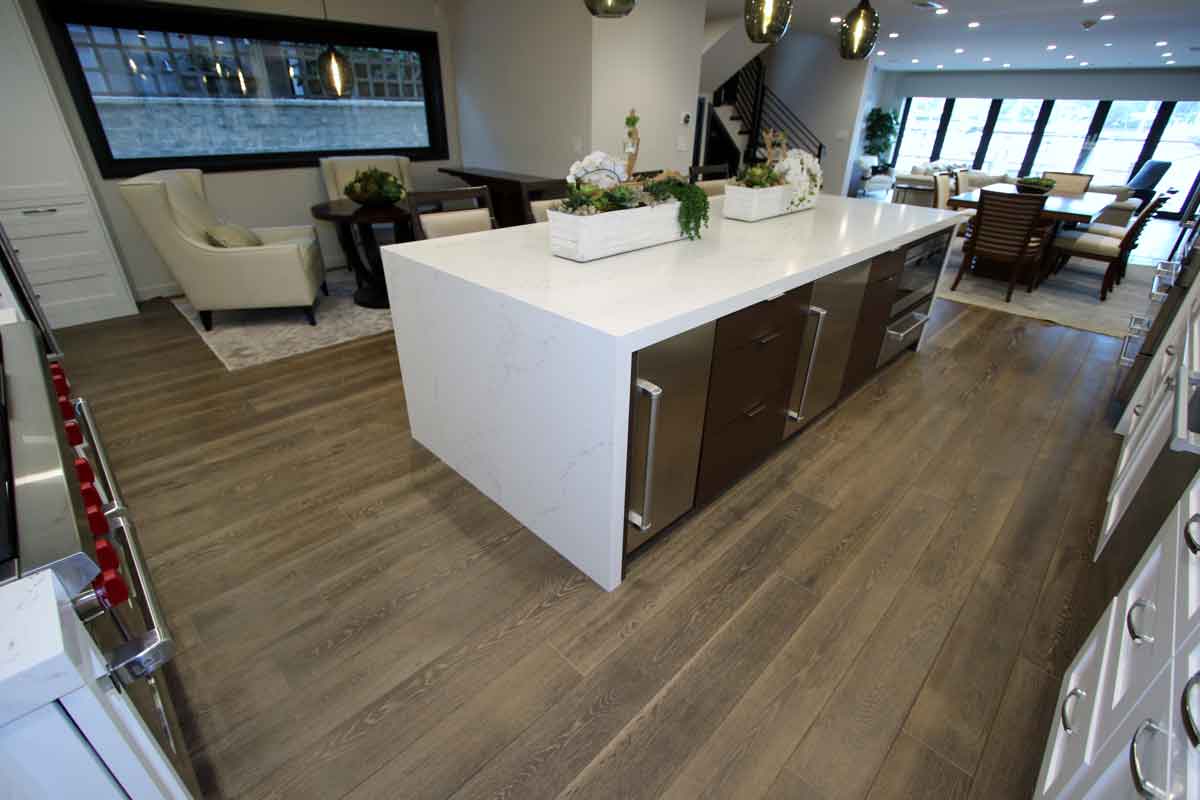
An expansive island was added to the center of the kitchen in the new design and it is surrounded by an abundance of perimeter cabinets, both upper and lower, for plenty of storage. Between the living and family room is a dining area, but there’s also seating for at least four at the large island.
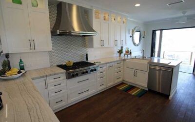
High-end appliances were used in the kitchen and include a stainless steel Wolf gas range and a 48-inch Sub-Zero stainless steel side-by-side refrigerator with a dual refrigeration system, three adjustable, spill-proof glass shelves, and a glass door.
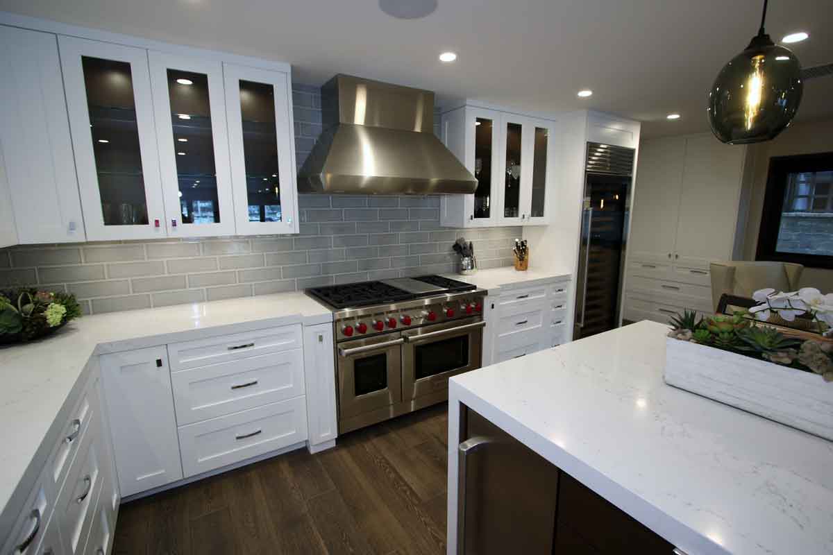
A Wolf warming drawer was introduced in the kitchen design as was an incredible large-capacity wine storage unit. This Sub-Zero Wine Storage unit features pullout shelves capable of accommodating bottles, half bottles, and magnums.
The perimeter cabinets in this Newport Beach kitchen are single-panel Shaker-style cabinets in Straight White, which feels fresh and clean. Several of the cabinets also feature a glass inset for display purposes.
The island, which is really the focal point of the kitchen features a white waterfall-edge stone top and more built-in storage.
Oversized light-colored glass tile is used as a backsplash, while a bit of drama is added to the kitchen design in the form of the glass pendants hanging above the island.
Recessed lighting runs throughout the entire main level keeping the space feeling airy and the ceilings feeling high. There is seamless wood plank flooring in a shade of rich brown that also runs throughout.
Also to the side of the kitchen
A cozy breakfast nook area was seamlessly added, set against a large picture window.
The Master Bathroom
Prior to this Newport Beach remodel, the master bathroom, while large, was overly outdated. The primary objectives in the redesign were to maximize available space. Add storage and of course just breathe new life into the design.
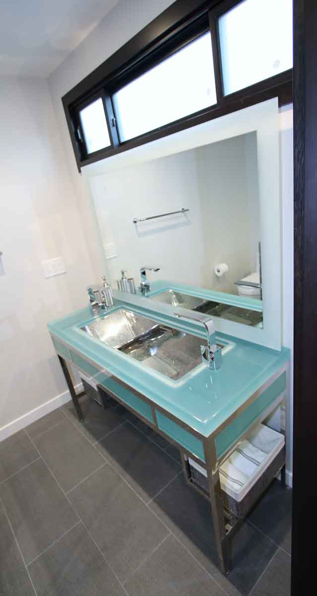
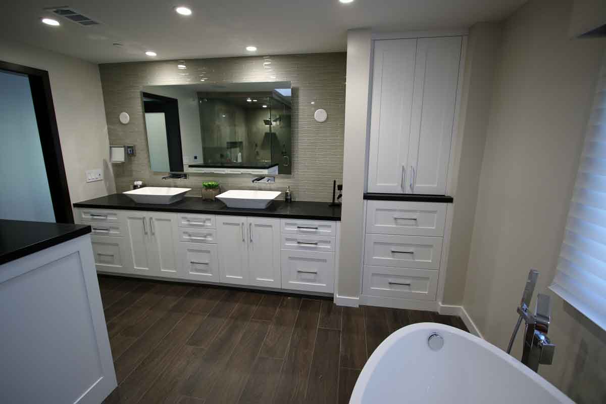
This was accomplished in several ways. First, APlus designed and built custom cabinetry throughout. As in the kitchen, these cabinets are Shaker style in Straight White. The countertop is an Absolute Black Honed Granite, for a dramatic juxtaposition. The countertop features a 1 ½-inch Mitered Square Edge, and the backsplash features Eleganza Tile in Liquid Latte with Custom Oyster Gray grout and the smallest possible grout lines.
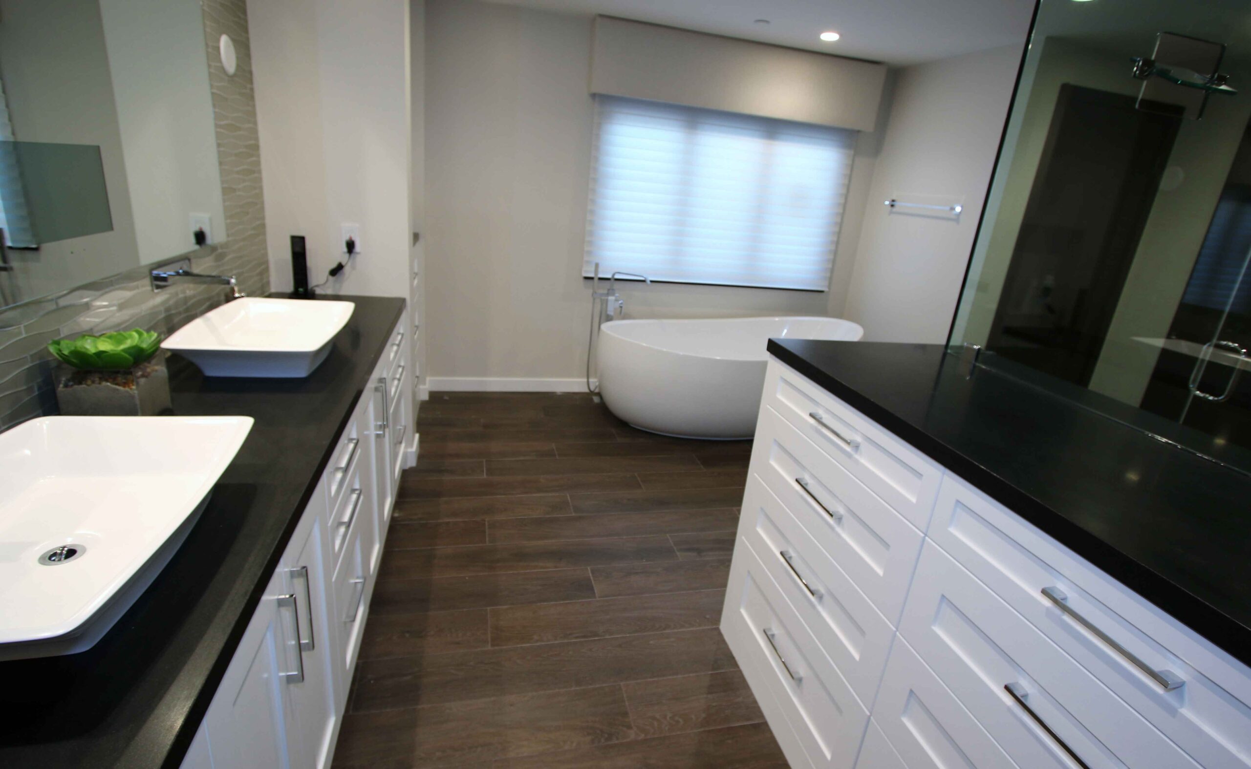
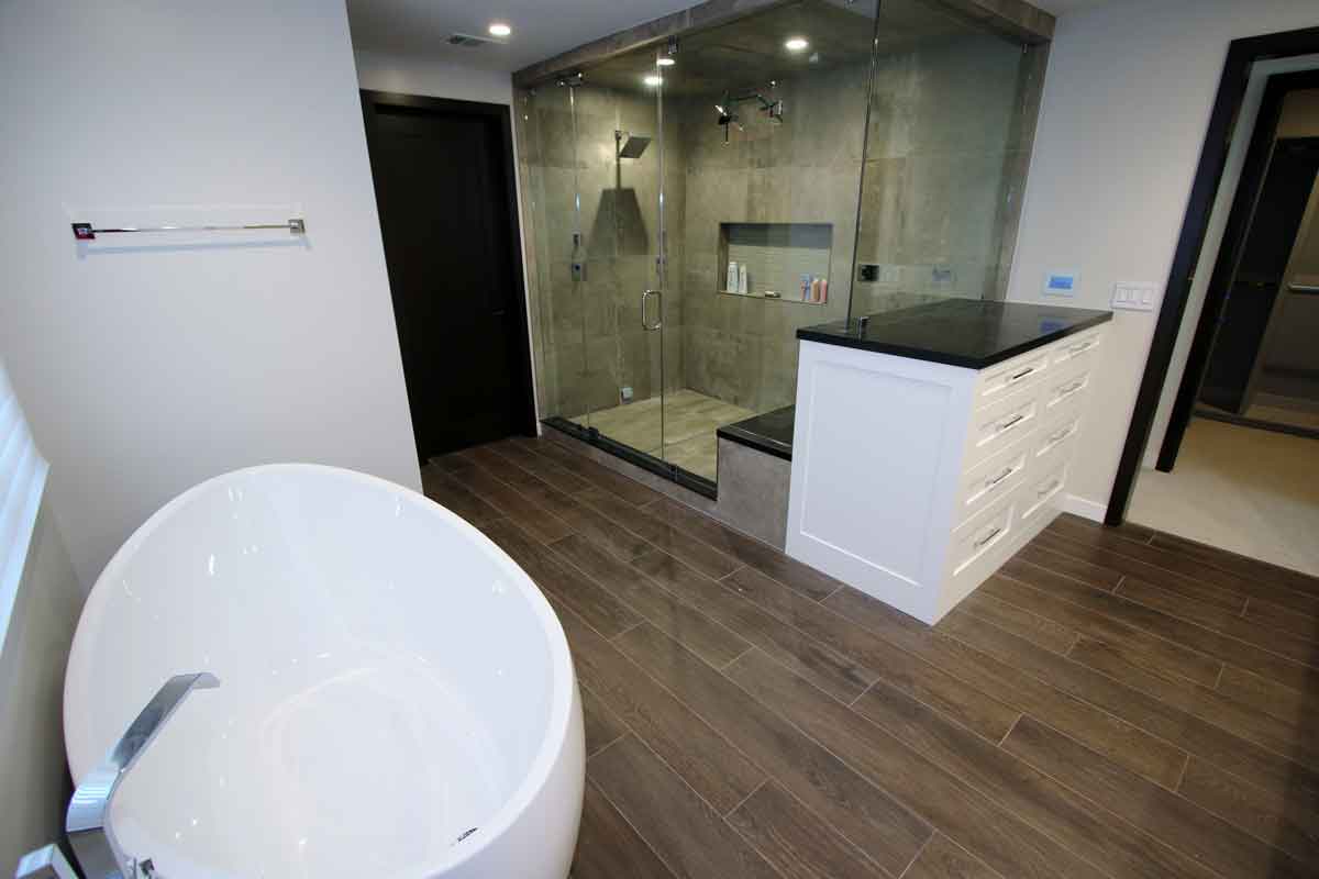
The wall tile in the shower is Concrete Argentino, while the soap niche detailing matches the mirror backsplash. The walk-in shower was expanded and a seat was added as well.
Also in the master bath
Stunning standalone soaking tub was added against a large window. Rather than being located in the corner as it was in the previous design.
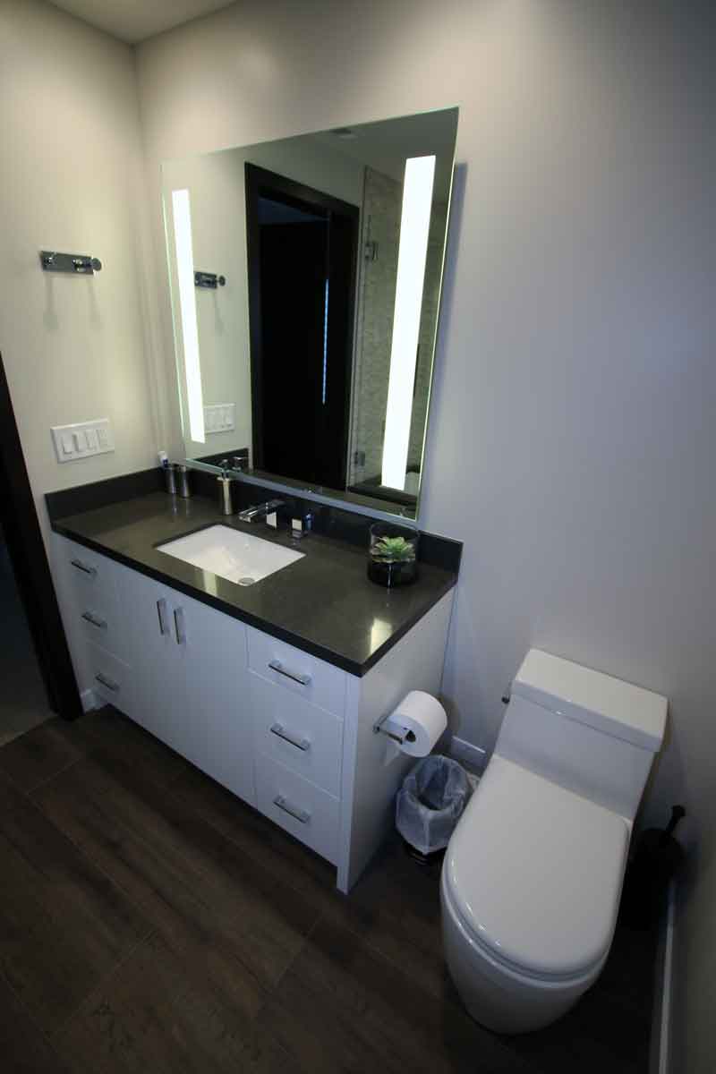
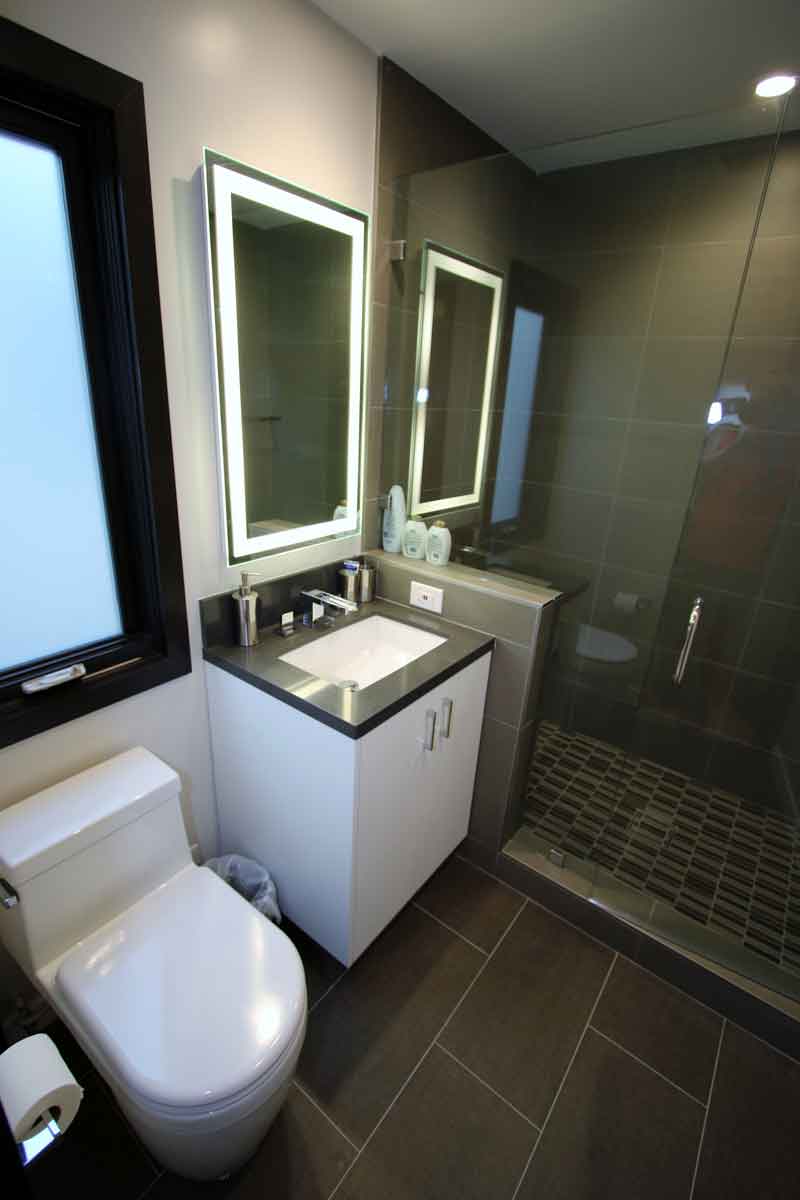
In the daughter’s bathroom again cabinets are Straight White in color and feature a slab door style design. While the countertop is Pental Coastal Gray, with a 1 ½-inch Mitered Square Edge. The backsplash includes 4 inches of countertop. Shower wall tile in this bathroom is 12×24 Bianco with a horizontal, straight install.
The home’s office bathroom features Eleganza tile in Fabrique-Silk and shower wall tile in Delorean Grey.
In addition to beautiful. Chic and artistically-inspired tile work and simple color palettes consisting of a combination of light cabinetry with darker tile and countertops. Each of the bathrooms in this home has unique features. Such as an Elixir wall-mounted electric makeup mirror with high-output LED lighting.
There were even items selected with the help of APlus to include in the laundry room. Redesigned, including the Electrolux front load washer and dryer pair. APlus also added a quartz countertop with a square edge in the laundry room as part of the design.
The family who lives in this Newport Beach home will be able to maximize their time spent outdoors. Thanks to the addition of items such as a Wolf 36-inch outdoor grill with burners and infrared sear zone.
Overall, APlus worked to achieve a few big goals in this Newport Beach remodel. First, we wanted the homeowners to be able to enjoy the views their home affords them. As well as plenty of natural light. We wanted their home to feel like a modern oasis. Still balanced elements of transitional design for livability and comfort. The home now reflects a space that’s perfect for entertaining and relaxing. Each and every detail has been carefully selected to reflect the personal style. Also the lifestyle of the people who live there.

